Selden Antique: Kitchen
Selden Antique Project: Kitchen
Day two of our two-week series exploring every corner of our latest design project, the Selden Antique. Today, we look inside the eat-in kitchen.
Today we arrive in the heart of the home, the kitchen. Creating consistency from the adjoining formal dining room and sunroom, we chose to continue the soft palette and mix of contemporary and vintage selections, a design choice that creates a natural flow throughout the home. There’s a lot of special moments in this space!
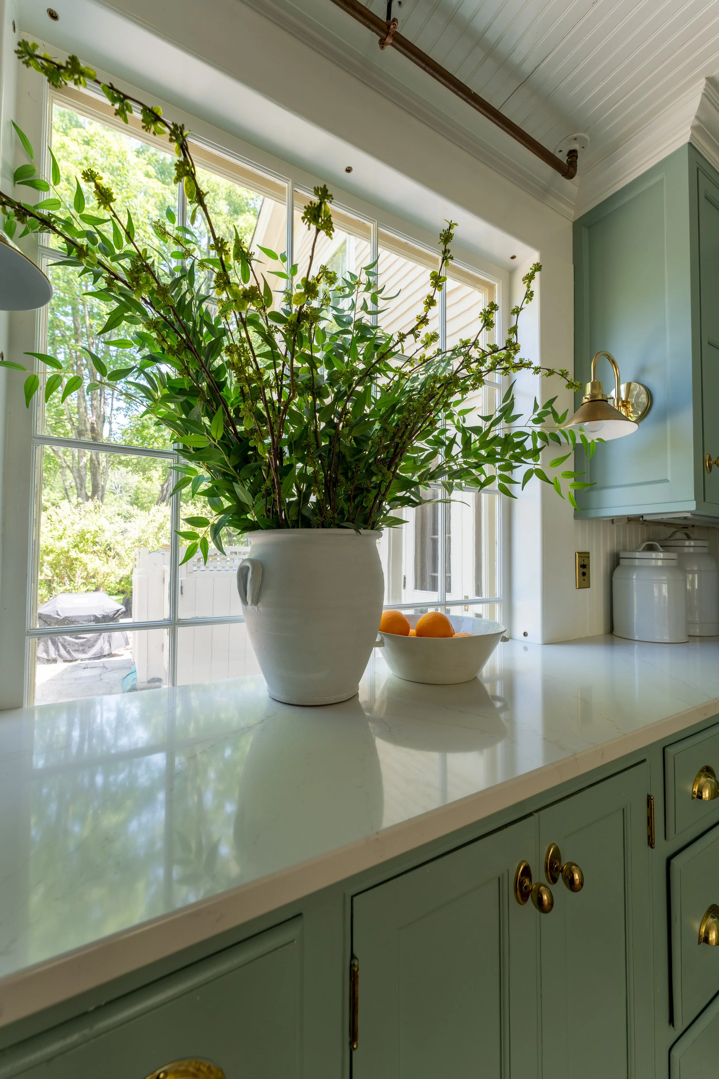
This kitchen is full of luxury moments, where attention to detail and unique choices create a one-of-a-kind kitchen. The bulk of it was already existing prior to moving in, including the original floors, cabinetry, countertops, plumbing/faucets, appliances, and even the built-in banquette bench. It’s a classic country kitchen built with incredible craftsmanship, and has stood the test of time. We provided the furnishings, lighting, styling selections, and even the comprehensive kitchen supplies. We also organized the interior drawers so that everything was turn-key ready for our client’s move-in.
We wanted to take the look of a very classic kitchen, and infuse a contemporary look with white oak furniture, brass lighting, natural fiber runners, curated countertop selections, and fun fabrics.
Though the cabinetry only runs on a single wall, it provides so much storage space so we were able to use the open shelves above the sink for display of pretty entertaining supplies and decor. The trick with styling is to mix in a variety of materials, shapes, and heights. There really is no perfect foolproof formula, just keep at it until it feels right.
“If you have open shelving in your kitchen, use it as an opportunity to style decor items, rather than solely using it for function. This approach will create a more balanced, appealing aesthetic.”
During our hunt to find a functional vintage pantry cabinet, we came across this antique jelly cupboard at Homeward Collective in Old Lyme. The dimensions were a perfect fit, and the color was a near-perfect match to the blue cabinets; it was meant to be.
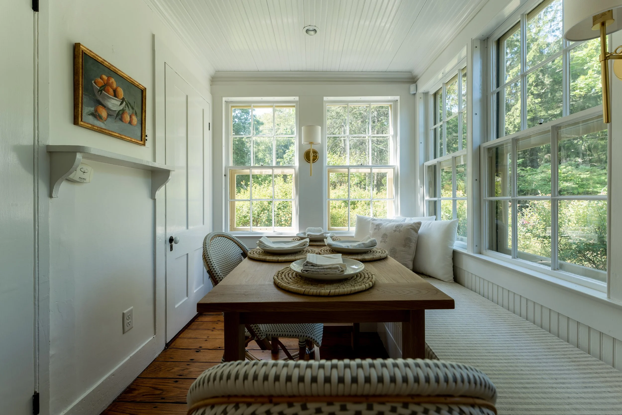
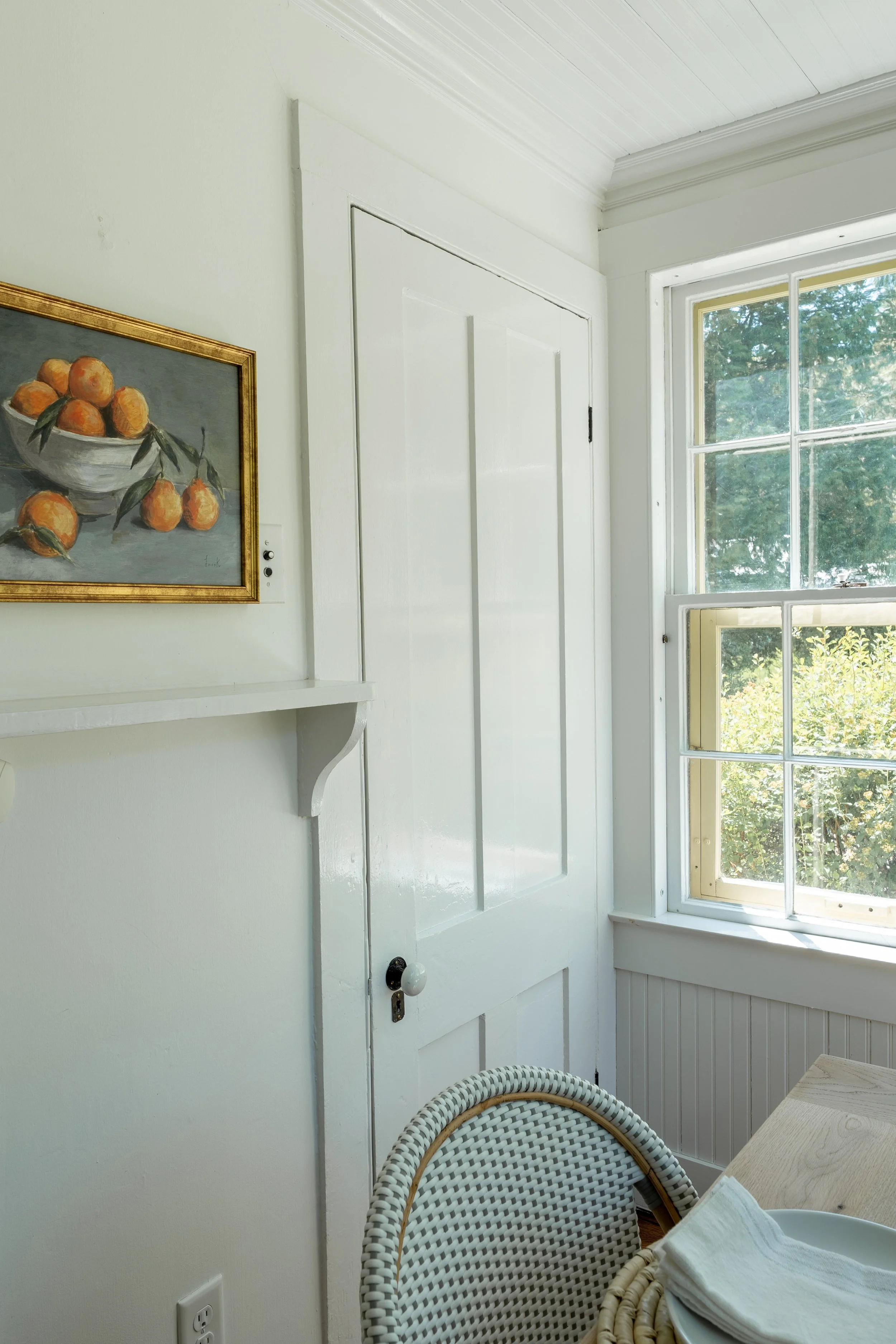
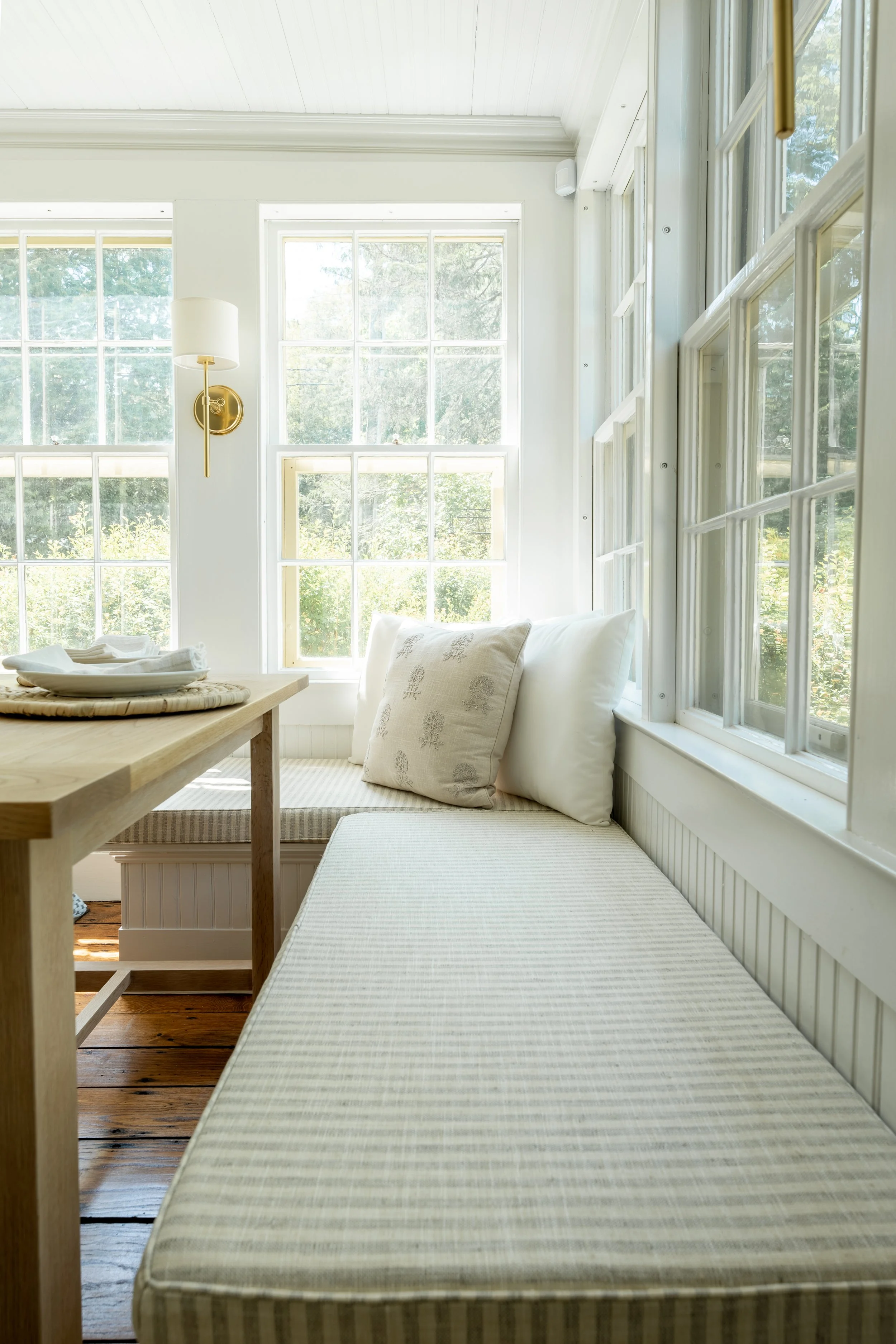
Within the kitchen is a built-in breakfast nook. The bench has a vertical molding detail in the kitchen’s same color, a bright, crispy white. Our client had two requests for the banquette breakfast nook: a functional table to fit within the tight dimensions of the space, and kid-friendly components for everyday use. Initially we thought a round table might soften all of the angles in the space, but the nearby wall posed a challenge; and the size of the table that would fit would not offer enough surface space for true functional daily use (so we pivoted to a rectangular table). The allotted space in the area was already tight, and on top of that there are two doors that provide access to an attic and basement. Even though these areas aren’t frequently-accessed, it wouldn’t make sense to obstruct them. After a lot of searching, we came to the conclusion that the dining table we wanted and needed simply did not exist. So, we enlisted James McSherry of Carolina and James to build us a custom white oak table. We provided the desired material, dimensions (28”x48”), general design, and some details, and James provided us with some helpful feedback to fine tune the final design. Once the table was secured, we set our eyes on dining chairs and a bench cushion that worked for a young family. The seat of the Riviera Chair from Serena & Lily is made from a woven resin material that you can quite literally spray down (spaghetti sauce was what we had on our minds during our search!), making it the obvious choice. We ordered a custom cushion through The Sew Shack on Etsy. We went with a classic stripe in a Krypton fabric, which is the “rolls royce” of performance fabrics. Nathan and Merideth were a joy to work with– professional, timely, and skilled.
“The banquette table took a lot of planning to get it just right. It incorporates all of the tones found throughout the rest of the home, and it feels really organic. It’s the perfect contemporary look within a classic kitchen.”
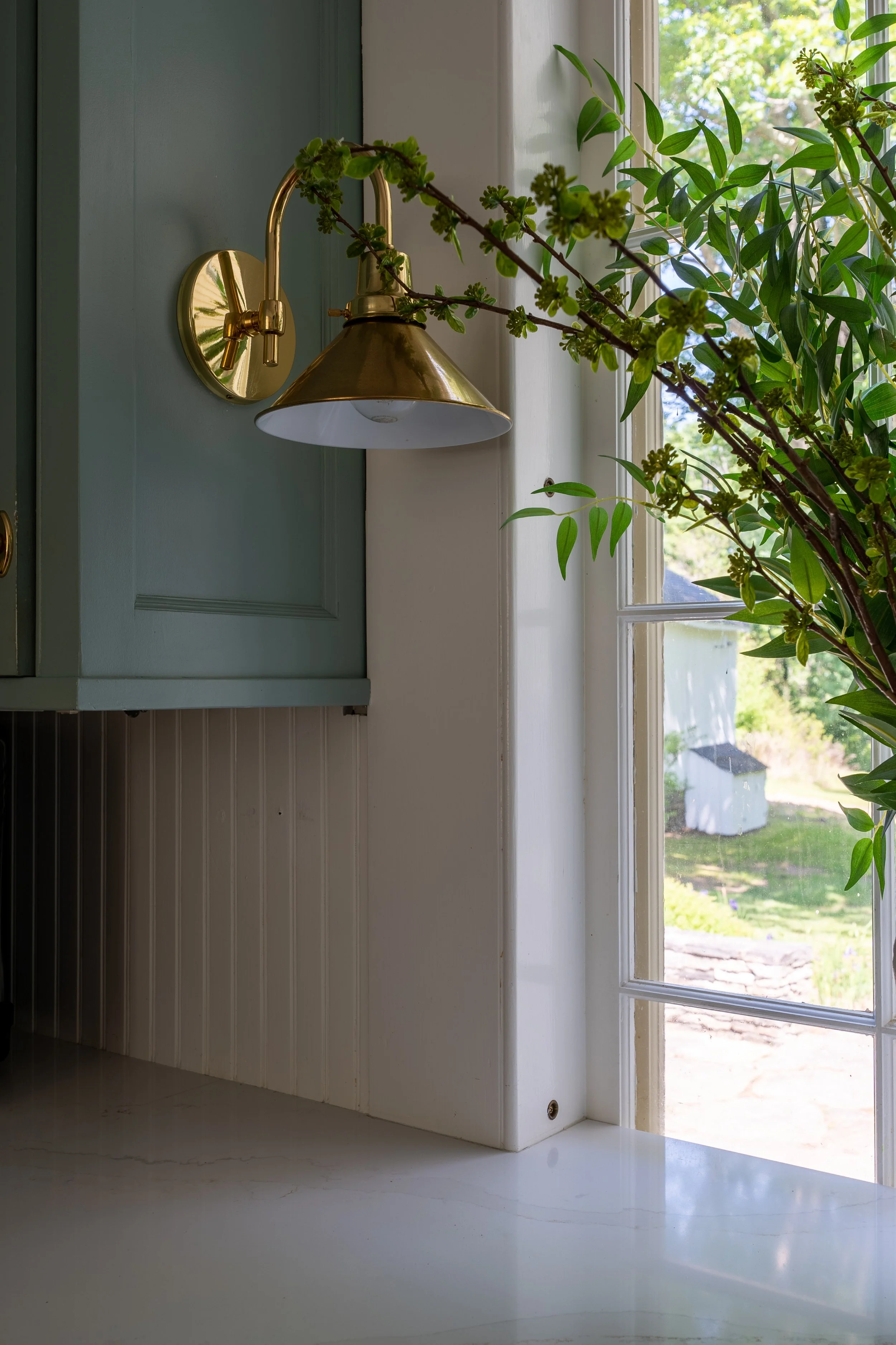
Pulling from the existing soft brass hardware, we selected a mix of brass wall sconces. We went with the more traditional Vendome Sconce by Visual Comfort around the perimeter of the kitchen, a hand-rubbed antique brass fixture with a curved arm and linen shade. In the breakfast nook, we went with the Keystick Wall Sconce by Rejuvenation, an elegant fixture with clean lines.

