AGH Lake House: Kitchen & Dining Room
AGH Lake House: Kitchen & Dining Room
Take a tour + get all the details.
Today we are touring a favorite room in the home, the kitchen (plus the dining room)!
The kitchen is one of my favorite spaces to design because it sets the tone for every other space. It’s the heart of the home, and it’s where we all spend the most time together.
I’m often asked how to go about making the most of a space when it’s not a permanent or long-term situation, and I think it’s how you implement furnishings and styling that can most positively impact a space. I think the kitchen at the AGH Lake House is a perfect example of that with thoughtful and effective personalizations of a space. When designing your own kitchen (whether you’re building from scratch, living in a rental, or knowing you want to do something better down the road but want to make the most of now), it’s really important to list out your top priorities and then work from there.
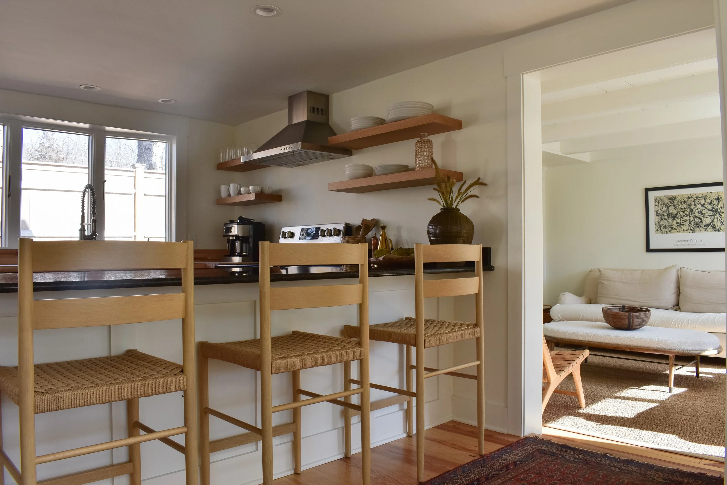
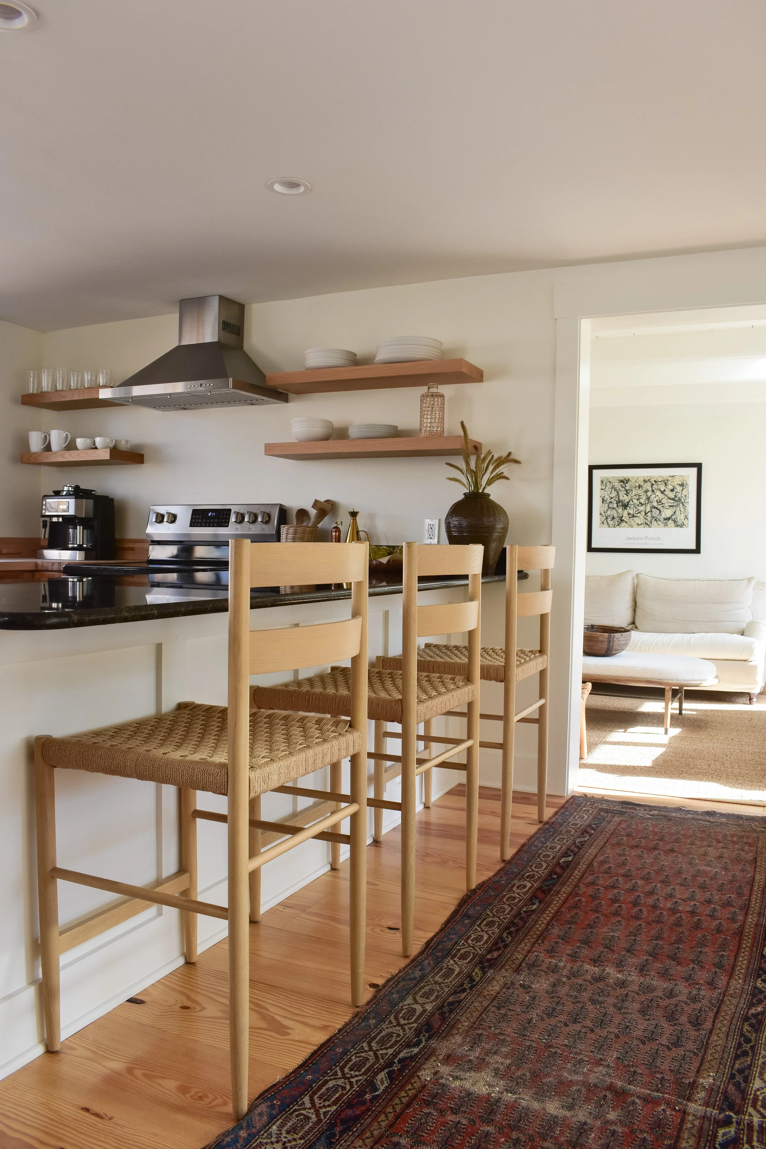
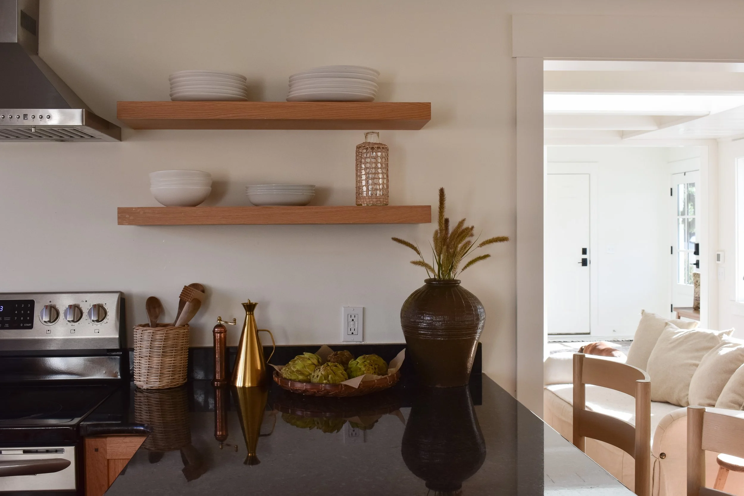
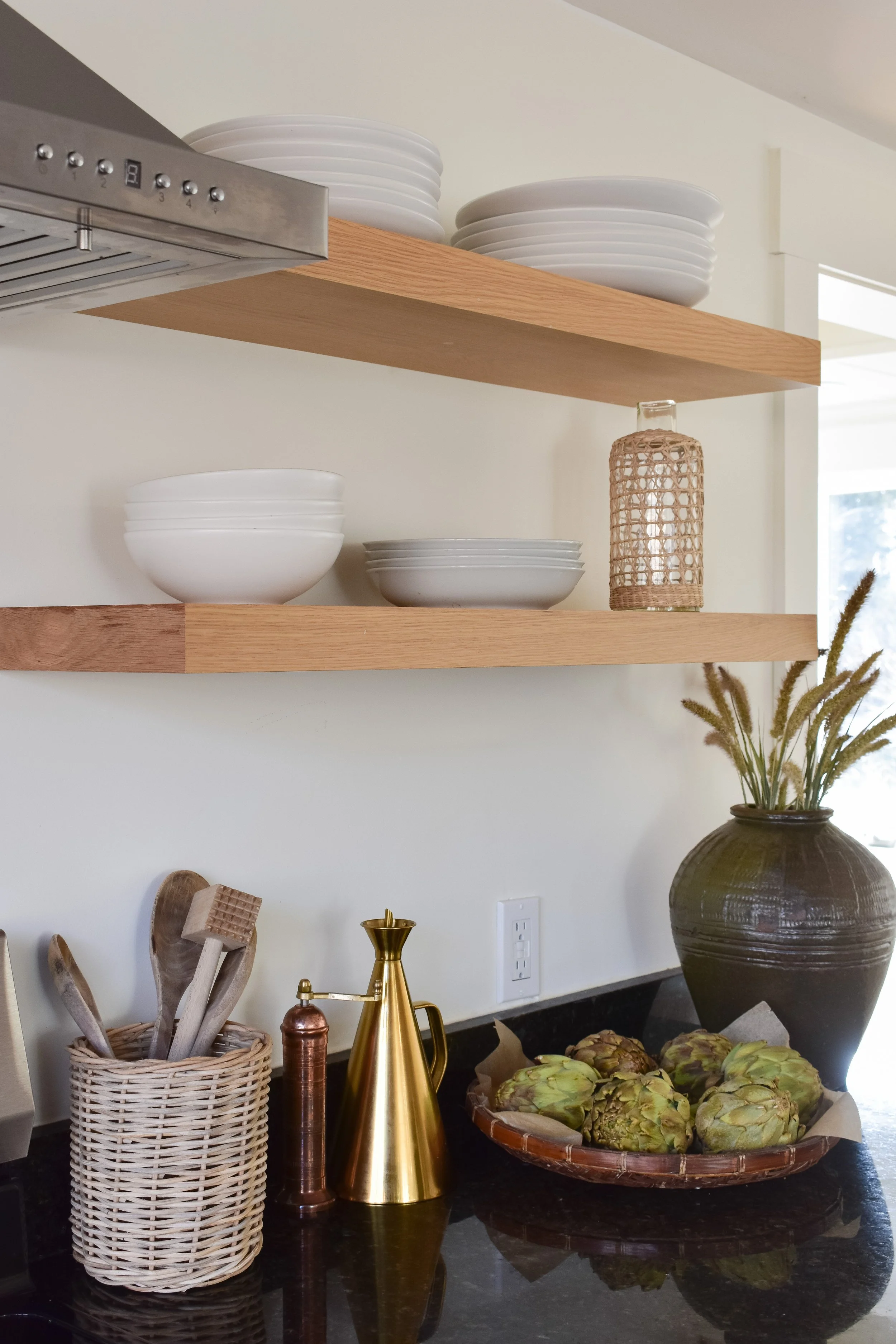
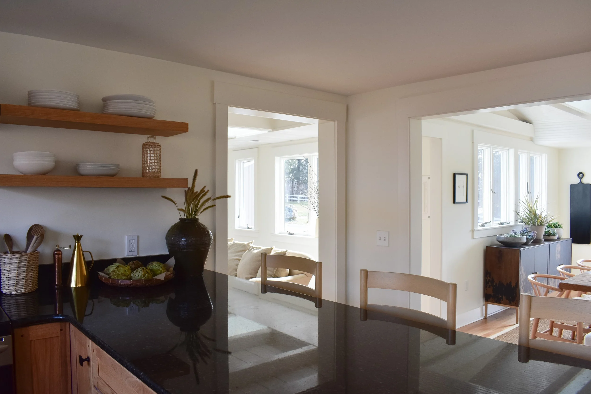
Prior to the gut renovation of the house, there was an existing kitchen in this exact space that had relatively new, unused kitchen cabinetry. Homeowner and local designer Bonnie Wittman and her husband Bill had the wise approach of giving the cabinetry and most of the countertops a second life (a no brainer in a rental/income property!), and then implementing small but effective changes within the space. For instance, after removing all of the upper cabinetry, we collaborated on the idea to add only open shelving— a move that really leveled up the aesthetic, modernized the look, and made the small space feel larger.
They gave the kitchen a serious facelift through all-new appliances and plumbing, the addition of a dishwasher, butcher block counters on the far wall, and detailed molding on the peninsula. The hood is always an opportunity to create a focal point, and I love the sleek one Bonnie and Bill selected that sits nearly symmetrical in the middle of the open shelves. Adding character and materials with history was an important part of creating a new kitchen that still referenced the past, and I love how the old flooring was able to be refinished and utilized.
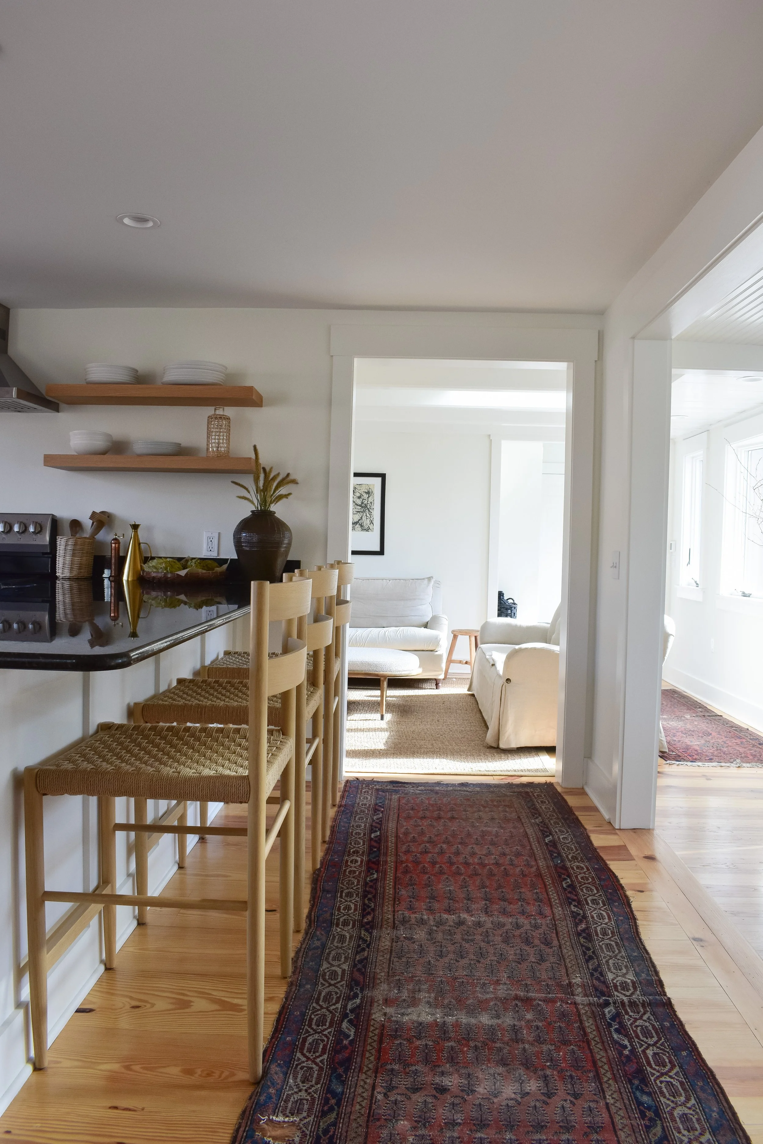
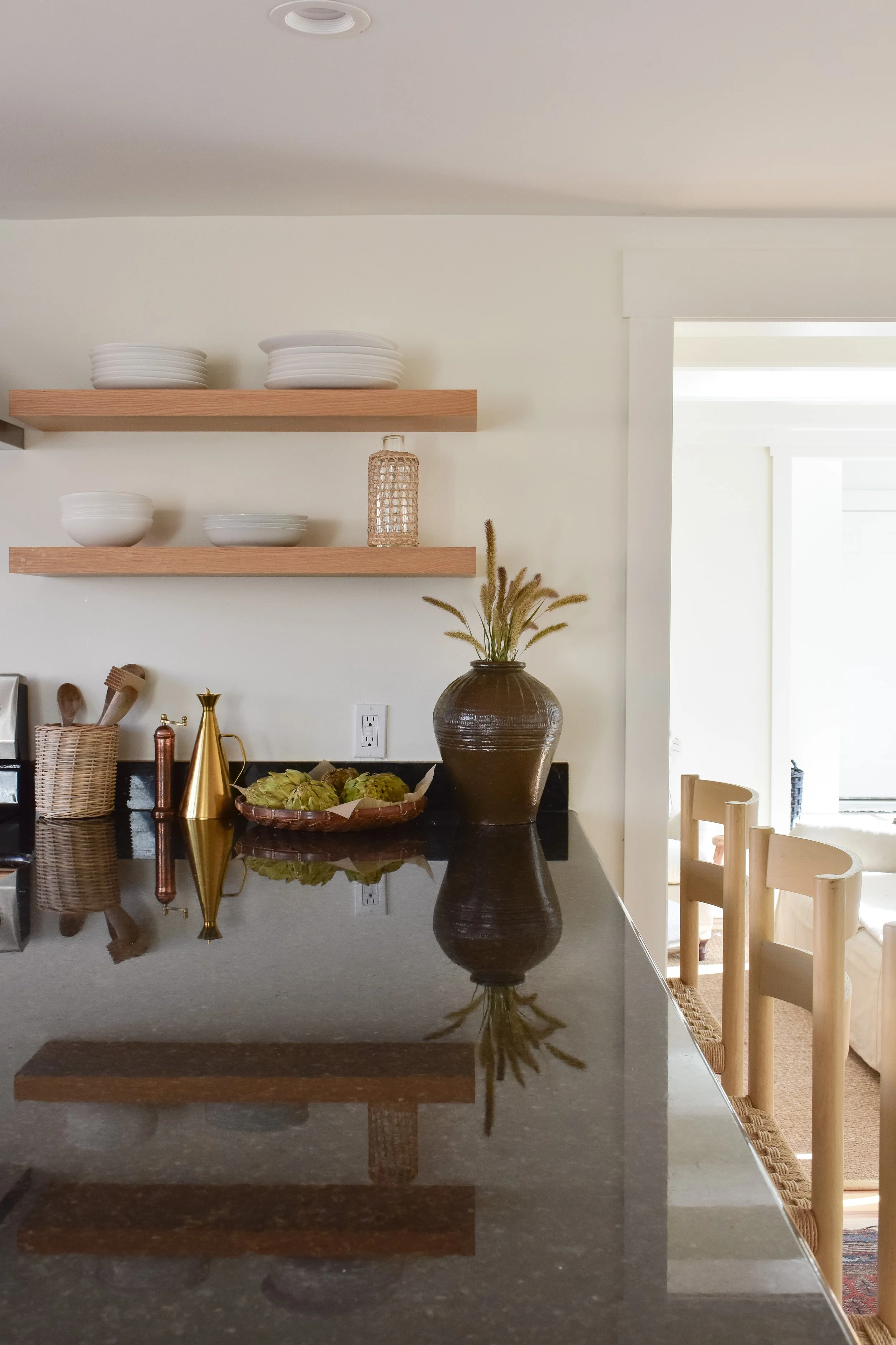
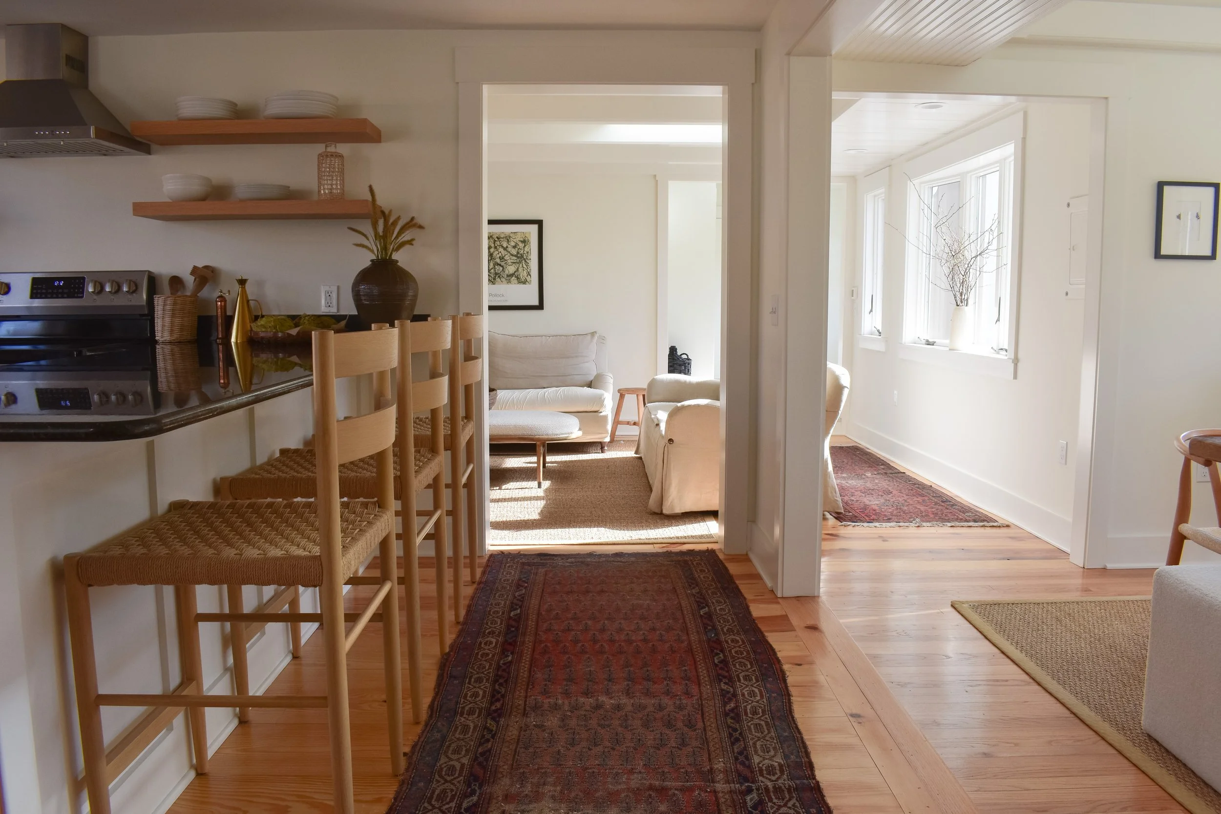
Like much of the rest of the home, this space was inspired by laidback California aesthetic and minimalism. The furniture in these two rooms are some of my favorite that we have in the house, including the woven seated counter stools. They may look delicate and high-maintenance, but they’re actually super sturdy and extremely comfortable. A vintage runner behind the stools and a vintage area rug in between the sink and island give the space some edge.
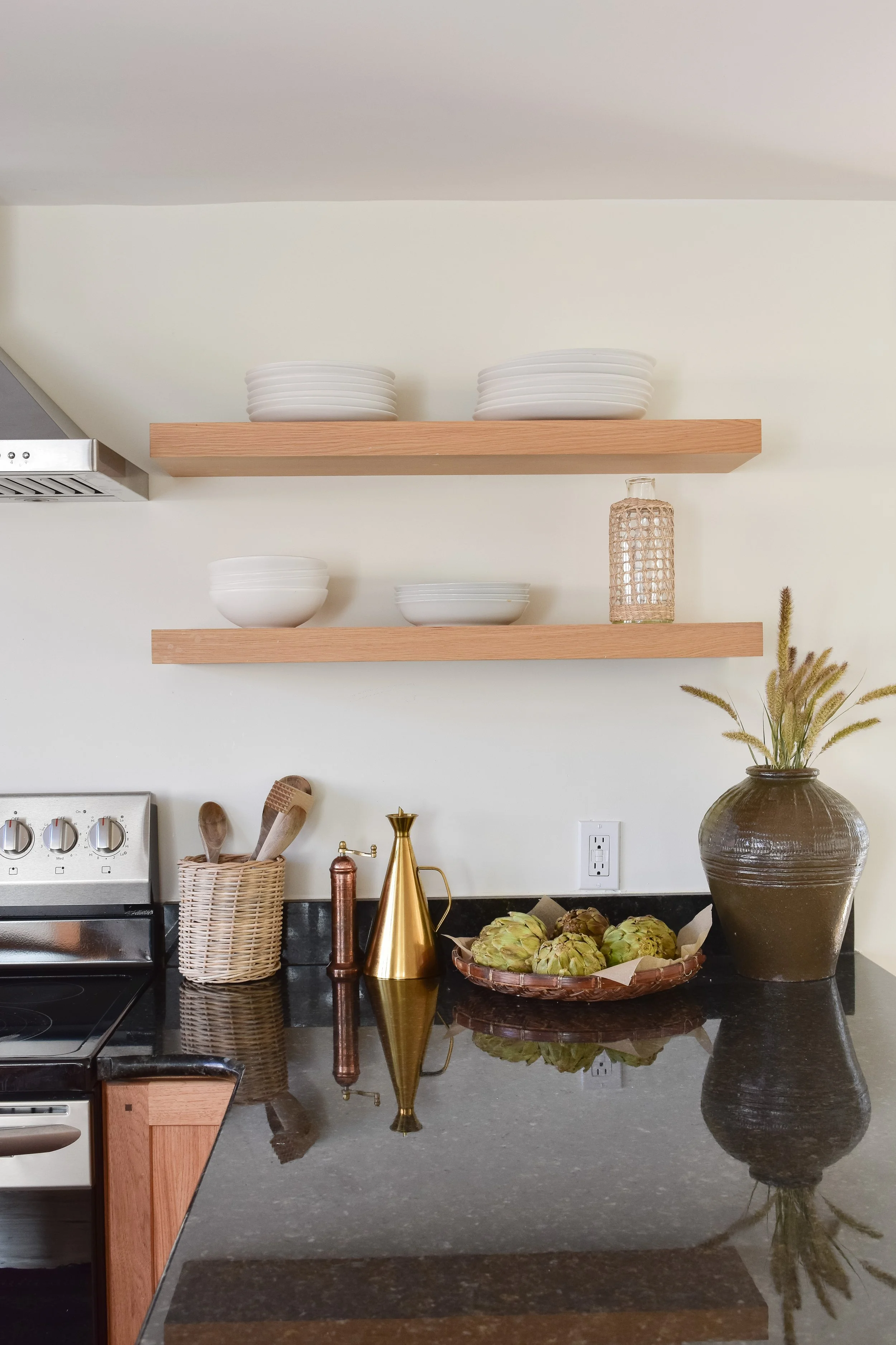
I kept the styling components and kitchen supplies to a minimum in this space. Our coffee/espresso machine is the only appliance that “lives” on the counter, and is located under our glasses and mugs to the left of the stove. The right side consists of bowls and plates on the right side, with a few wooden cooking utensils, an olive oil cruet, copper pepper mill, a vintage woven tray, and a vintage mijiu jar. The extra frequent-use appliances like the toaster, blender, frother, and tea kettle are stored in an “appliance garage” cabinet in a lower cabinet. And the less frequently-used appliances like the crockpot, stand mixer, waffle maker, juicer and food processor are stored in a small storage closet off the kitchen.
Shop the AGH Lake House Kitchen
Get the look.
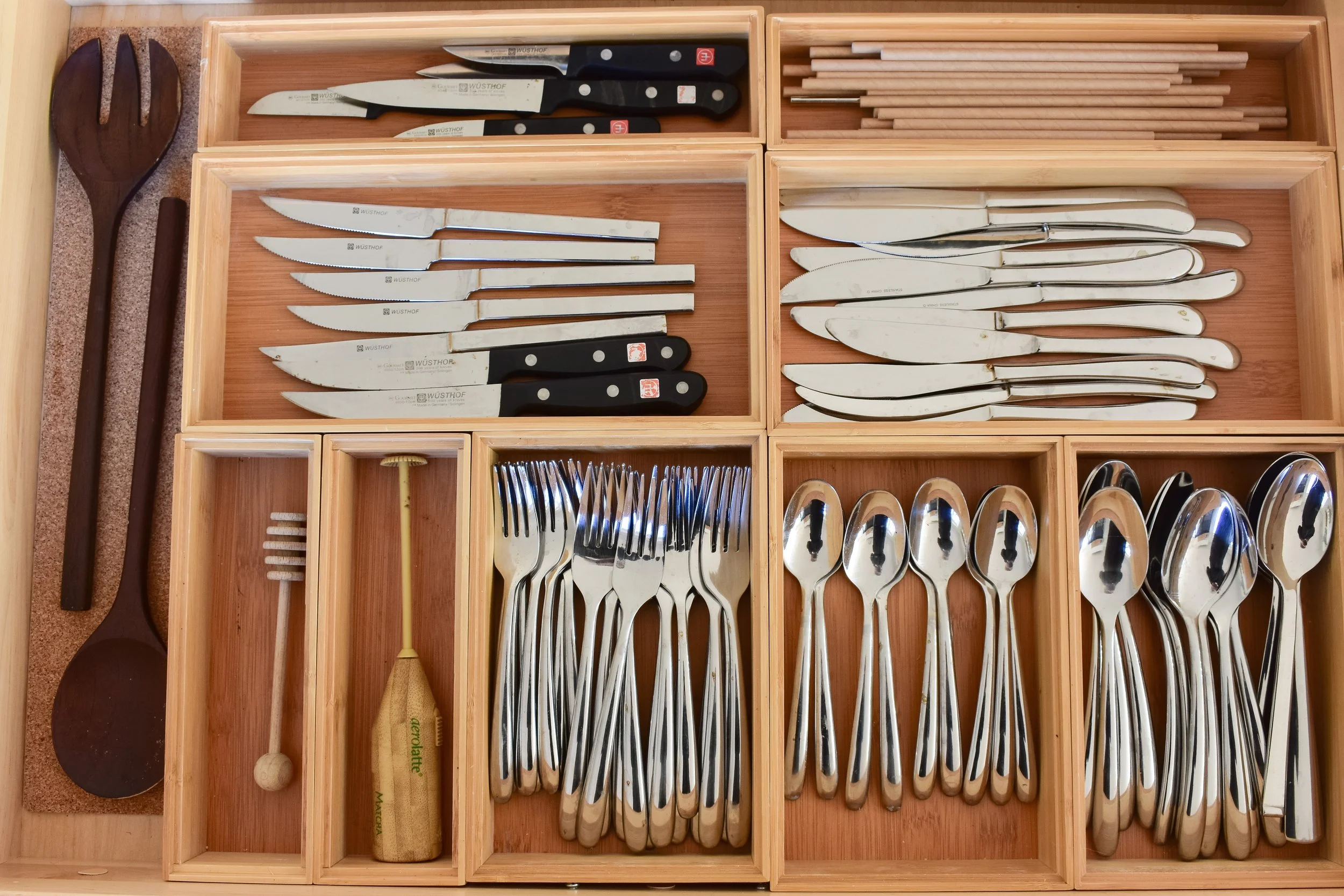
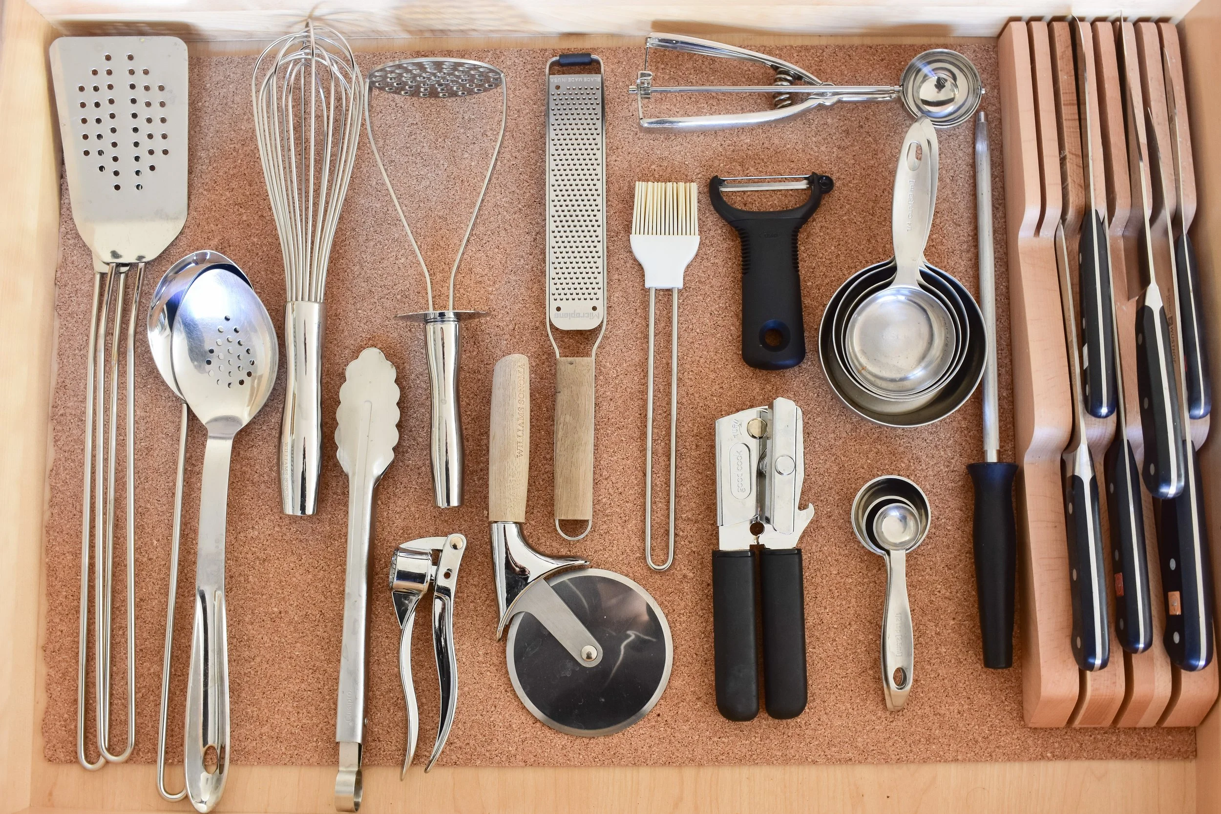
The key to an organized kitchen can largely be attributed to not having too much of anything. A curated collection of kitchen supplies has served me well over the years, and I continue to exercise that in this home too. In fact, in comparison to the AGH Farmhouse’s two prep and cooking utensil drawers, my dwindled down collection fit so well and easily in the Lake House’s single drawer, that I didn’t feel it necessary to have any organizational aid aside from a knife dock. We’ve lived here now for eight months, and these supplies have been more than enough for our daily use.
Across the back of our island, we integrated all of the functional things that you need in a working kitchen: pots and pans, baking sheets and trays, prep and measuring supplies, a few entertaining/serving pieces, and our collection of Le Creuset bakers which we cook with daily. A small black metal and glass-encased pantry holds a curated supply of goods in canisters, turntables and bins.
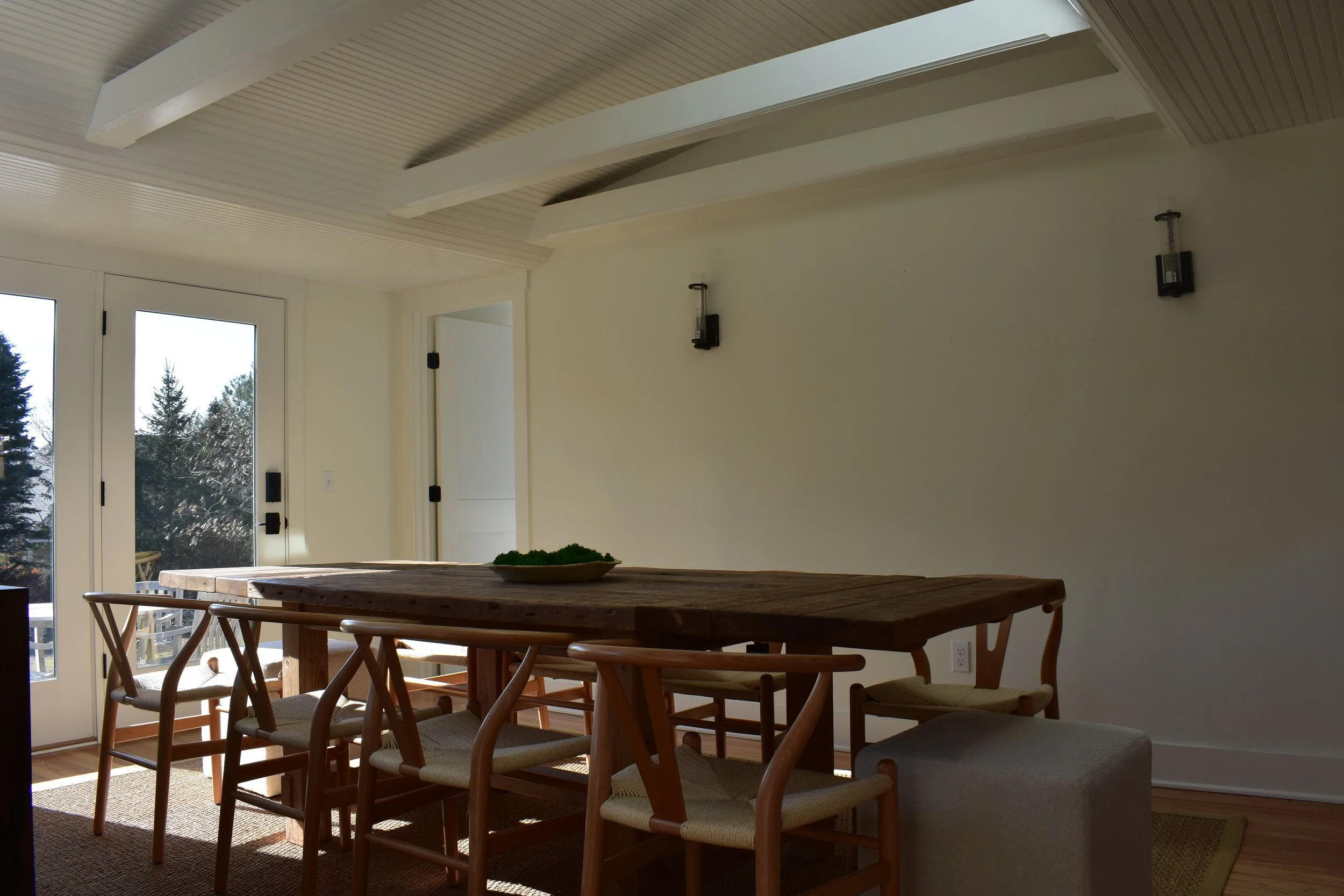
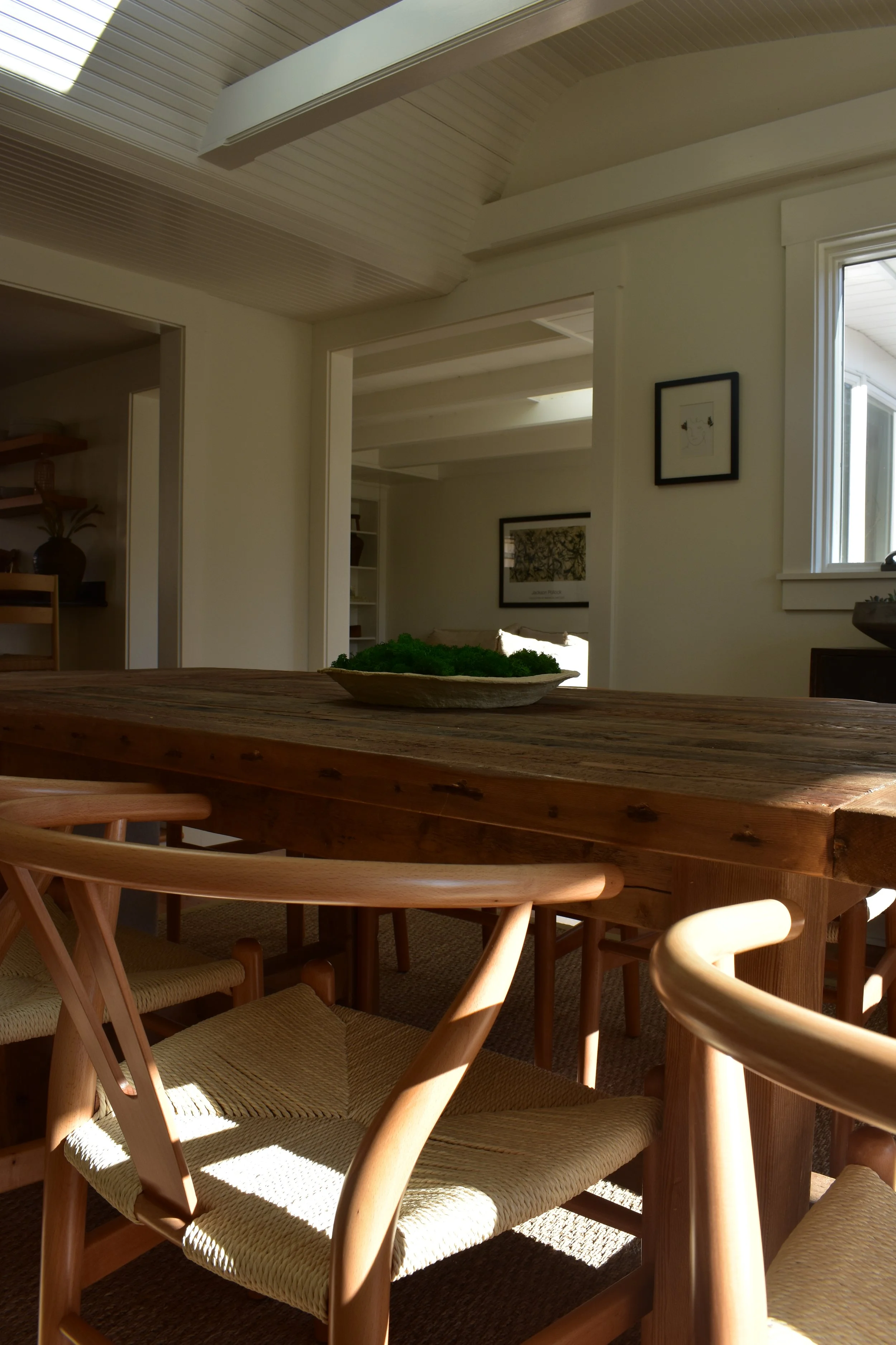
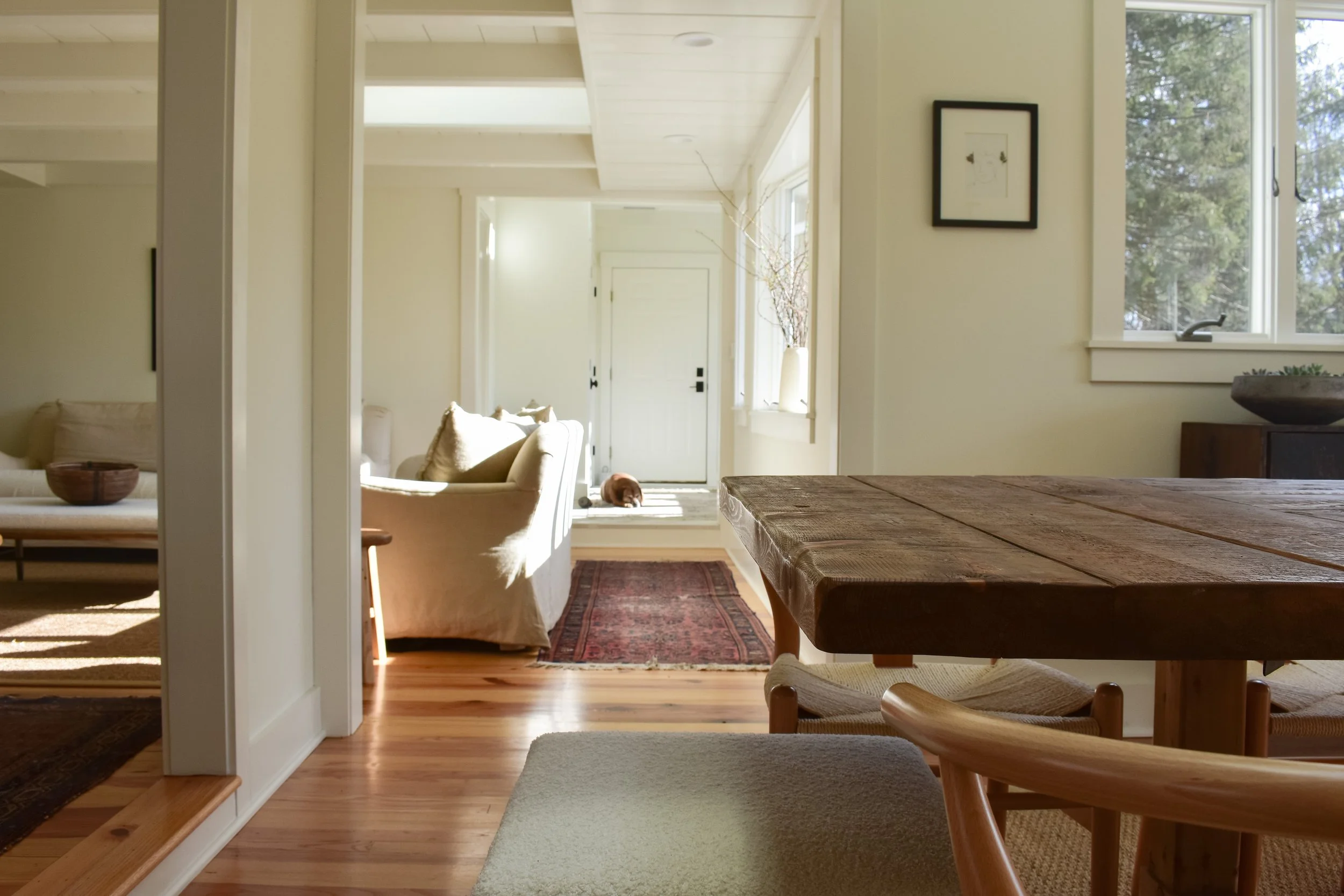
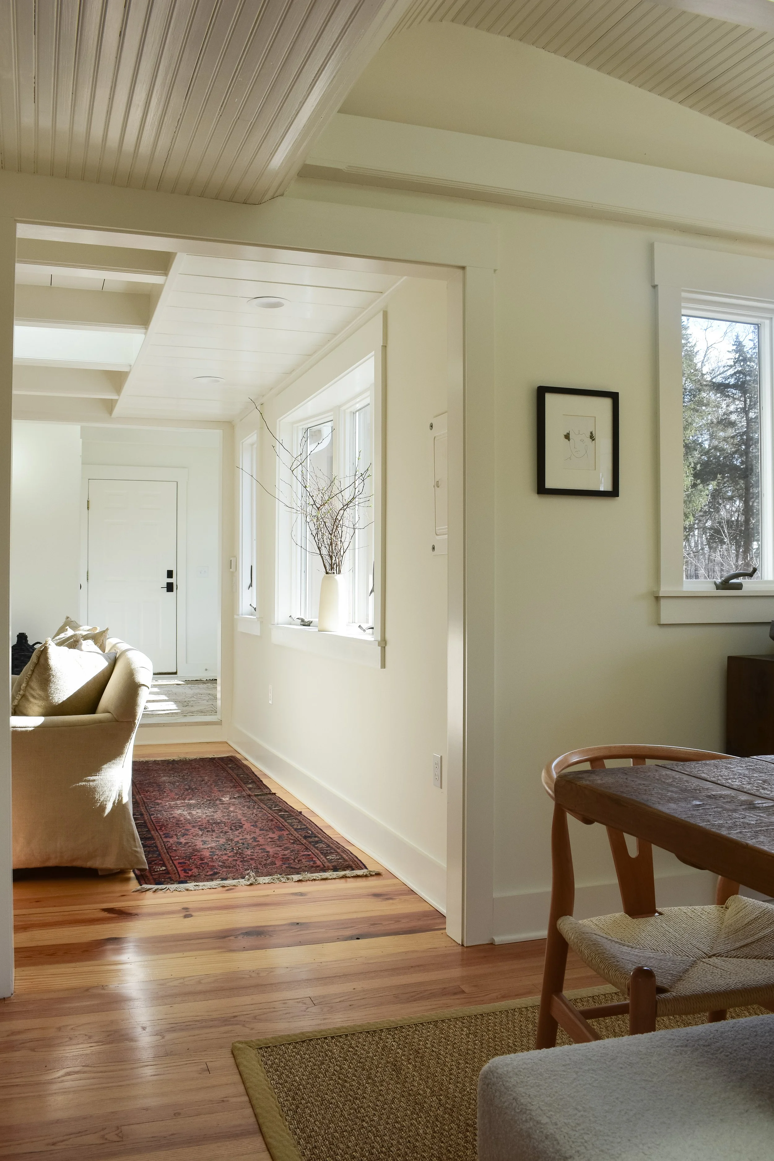
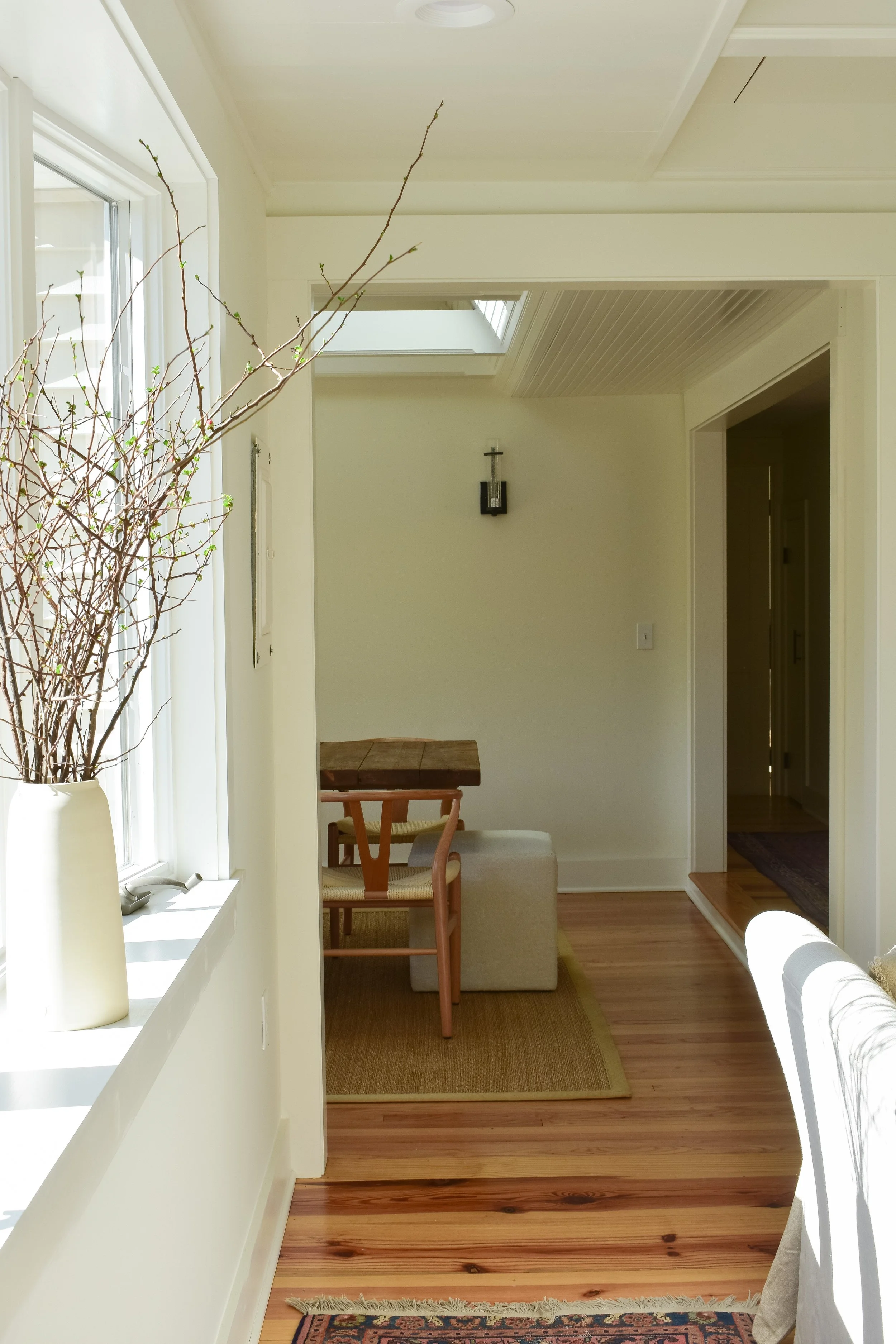
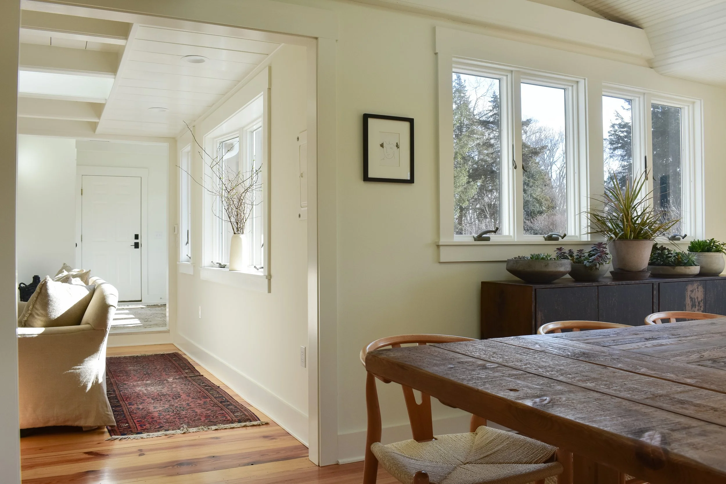
The kitchen is located in the dead center of the house’s open(ish) floor plan with access and views to nearly the rest of the home. It directly opens up to the living room and the dining space, and I love how the two adjoining spaces have beams, pitch, architectural interest and skylights in the ceilings. Hours upon hours of painstaking filling, priming, and painting went behind these ceilings; it was all orange knotty pine prior to its glow-up. Its new look allows the beauty and detail to shine through, and I love how it ties in with all the other detailed ceilings in the mudroom, bedroom, and my studio on the upper level. The entire home is painted in Sherwin Williams’ Greek Villa, a beautiful creamy white that works beautifully in well-lit spaces.
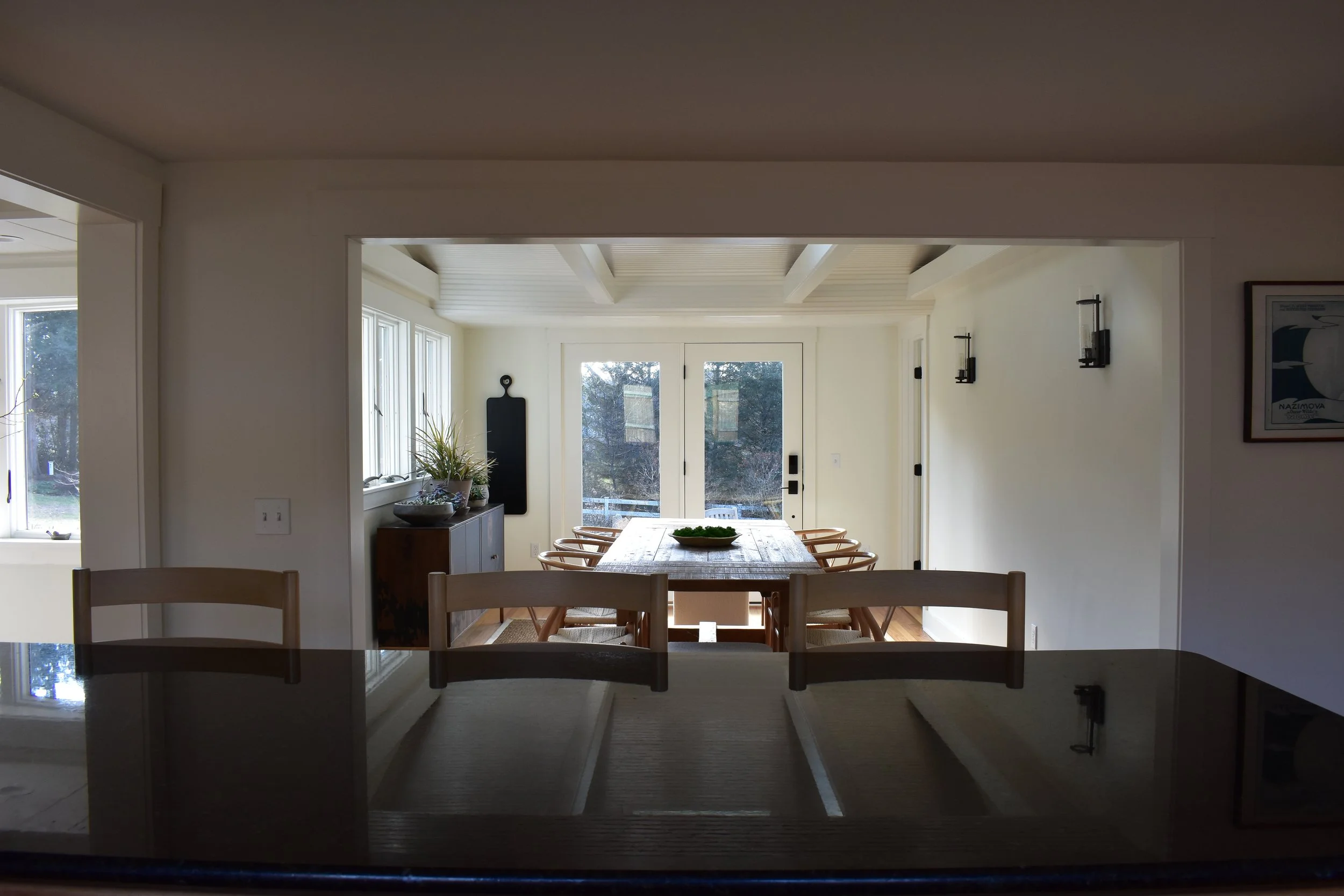
The design of the two rooms’ close proximity and open flow makes the dining room feel like a formal space and kitchen nook all-in-one. My goal was to bridge a beautiful formal and casual look together so it could work for any dining scape or situation.
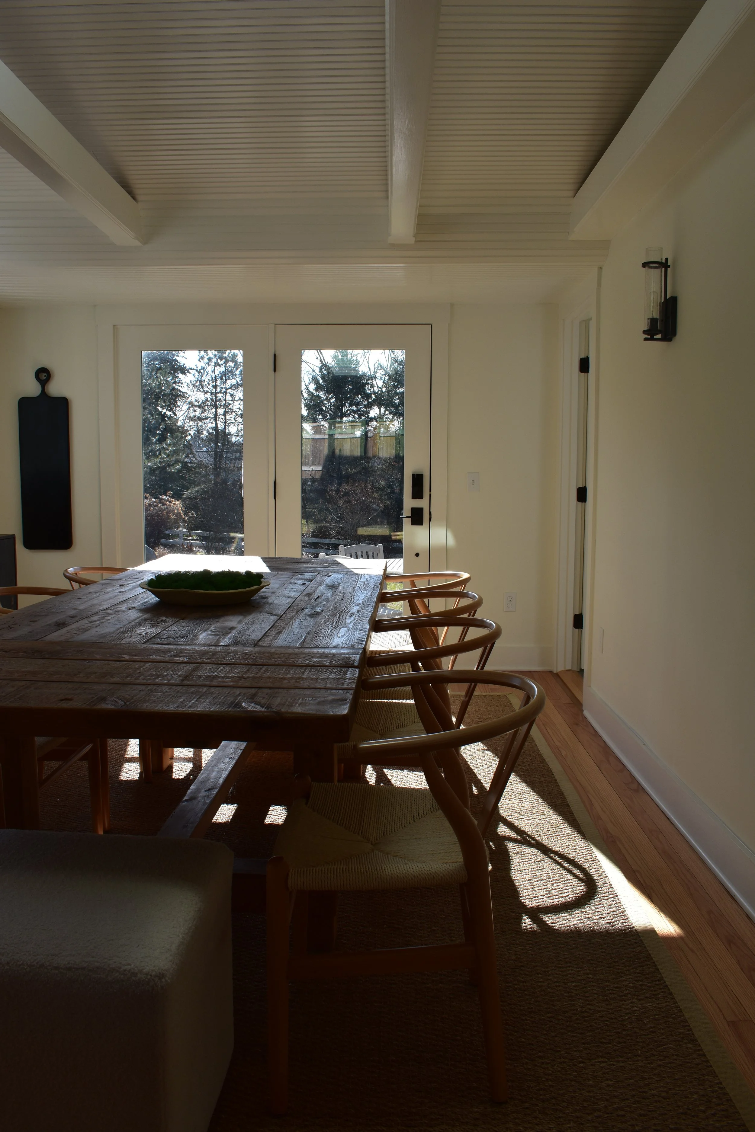
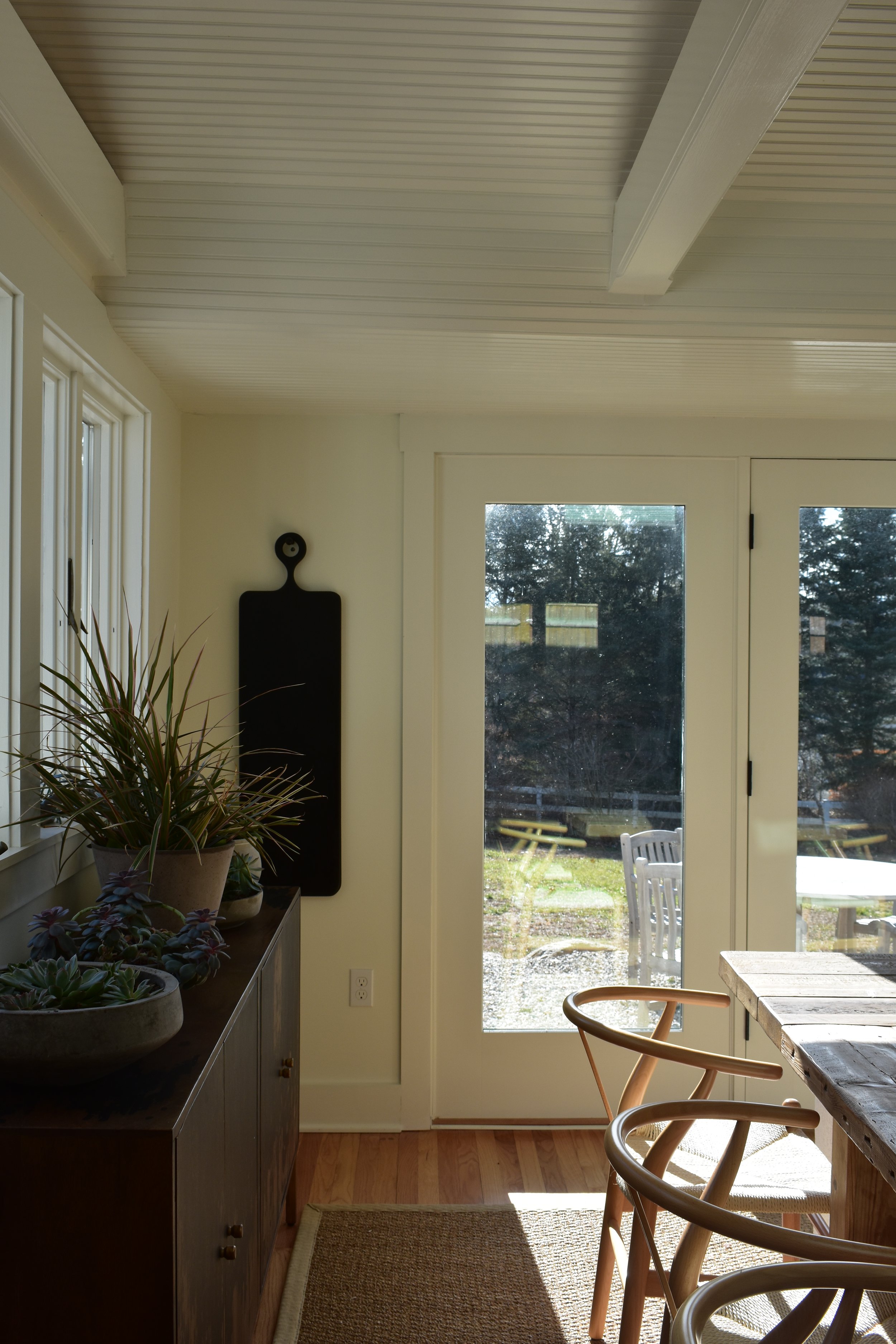
The entire home feels like one big sunroom as its south-facing, but especially in the dining room with the patio doors. I love that I can stand in the kitchen or sit at the dining table and see the yard full of evergreens and views of the lake.
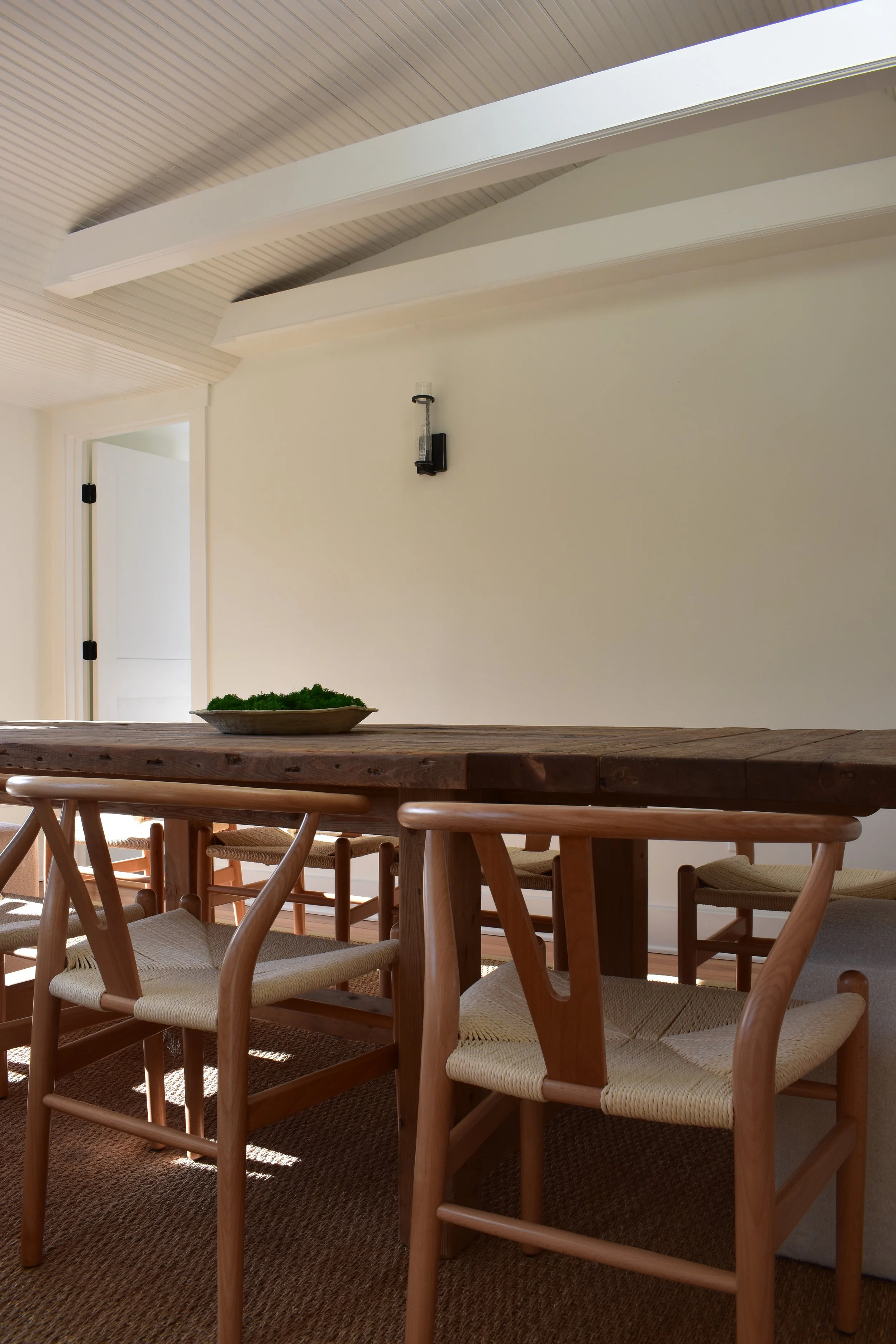
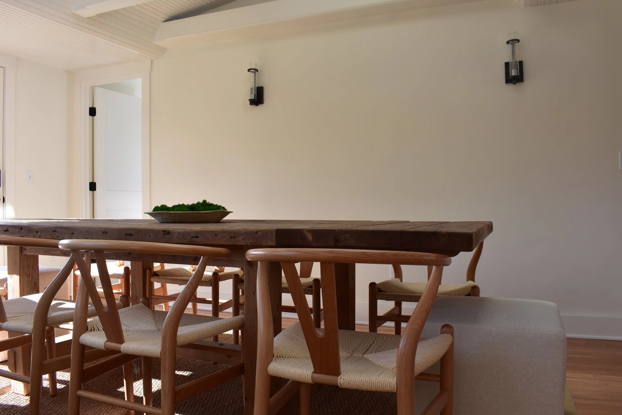
The table and chairs came over with us from the AGH Farmhouse. Aesthetically speaking, I actually think they work better in this house! The table is a statement, and I love how much space it takes up visually without being heavy. The mix of dark and light finishes gives the space balance. The distressed sideboard stores all of our barware and bar supplies, extra entertaining pieces, and outdoor dinnerware. To round-out the furnishings in the space, I added square boucle ottomans on each end of the table (an effective way to add extra seating and minimize its physical and visual impact), and anchored the space with a seagrass woven area rug.
Bonnie selected the amazing wall sconces that are streamlined and modern, but not too modern. We have a piece of art being repaired that will be installed on that big, blank wall, and it’ll make an appearance soon!
From the beginning, my design board for this space had lots of greenery. A touch of green goes a long way! In the kitchen, I have two vintage stools with vintage vases on top, one with willow branches and the other with weekly rotating fresh blooms. In the dining room, preserved moss sits in a low paper mache bowl on top of the table, and five varied cement planters with succulents live on the sideboard. They’re in the perfect spot to get lots of light, and they’ve been growing like weeds!
To finishing styling touches, a stunning minimalist piece from Wildflower Art Space and goop serving board sit on the walls. All of those little details are what bring a space to life.
Shop the AGH Lake House Dining Room
Get the look.
Thanks for following along with The AGH Lake House room tours. We have so much more of The AGH Lake House to share with you, and we can’t wait for you to see it. We’ll be back soon with more soon!

