Selden Antique: Living Room
Selden Antique Project: Living Room
An in-depth look behind every door of our latest design project, the Selden Antique. Today, the coziest room in the house, the living room.
Next up on our tour through A Good Home’s latest project, the Selden Antique, is the home’s cozy and relaxed family room.
This room is a casual space used for everyday hangouts. The goal in here was to create a space that feels dressed up, but not too fancy, so it’s livable and in line with our clients’ lifestyle.
In addition to lack of storage, another unique challenge to old homes is the smaller, chopped up rooms. While we actually love the closed off layout that defines each space and makes everything feel cozy, the size of each room posed a challenge (on a sliding scale, depending on the space). In the living room, we wanted to ensure enough seating was provided for the entire family plus any guests without overstuffing the space. This was the deciding factor behind the choice to place a long sofa on the singular long open wall (that doubles as a sleeper), two comfortable armchairs on the opposite wall that didn’t block too much of the windows, a pair of low profile stools (lightweight and easy to move around), all surrounding a woven leather ottoman. All of the selected seats are upholstered with performance fabrics. It’s all very livable and comfortable; put together but not too fancy.
Mixing furniture styles and ages is one of our signature approaches to design. For example, we balanced the newer, contemporary seating selections with vintage and vintage-inspired pieces like an elmwood accent table, earthy table lamp, a brass floor lamp, and the ottoman’s styling pieces. The selections and details echo each other, but aren’t necessarily a set. They complement each other through the color palette, shapes, upholstery, and material. We placed a slender white oak side table in a narrow spot next to the long sofa for extra surface space. The pillows are a mix of pieces from Homeward Collective in Old Lyme and a pillow maker on Etsy, and the fabric is Walter G. The entire room is anchored with a distressed CLJxLoloi rug with a similar color scheme.
In order not to block the flow of the room in the small space, we opted to place the woven stools on the far wall, and kept the space closest to the two doors open. That wall’s molding detail creates a built-in look, and is the understated focal point of the room with a low profile fireplace insert, frame tv, and brass sconces.
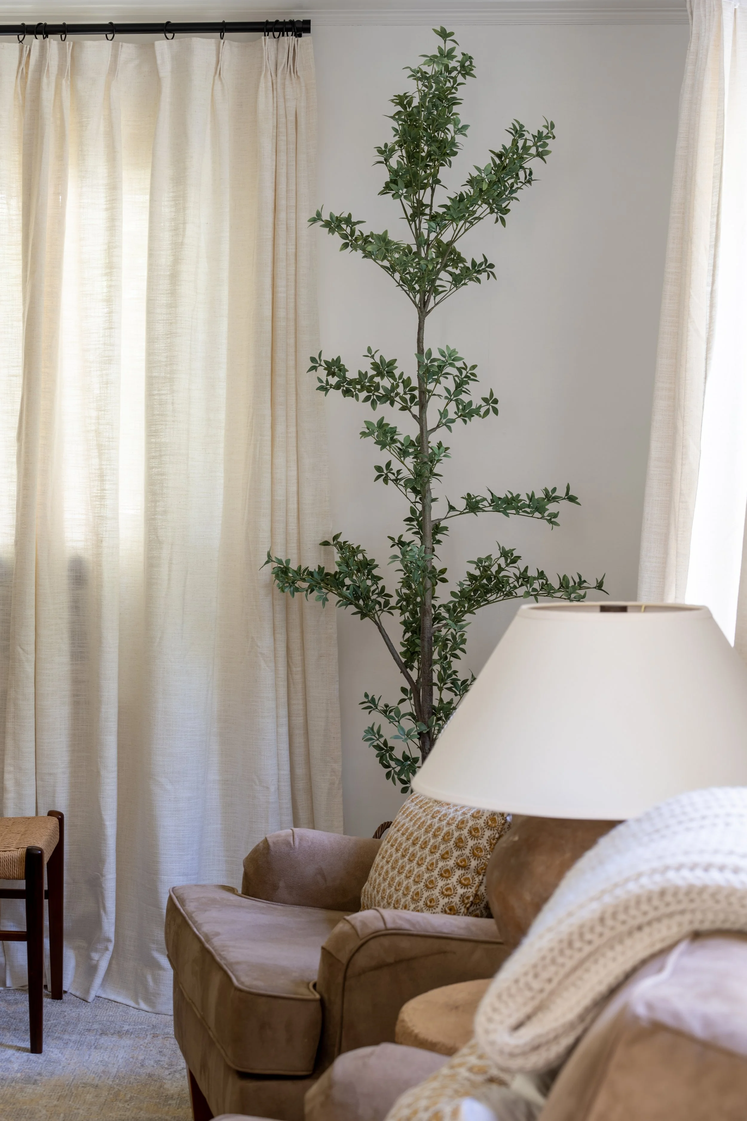
One of our client’s family members had a unique health condition that would prevent her from having any live plants in the house, so we incorporated all faux plants and greenery, including this 7’ faux olive tree. Most of the faux plants came from Afloral, but this tree was from Pottery Barn. Some major pros of using faux plants and greenery are that it’s zero maintenance and always green! High quality ones will look just like the real thing, too.
Our favorite feature in this room is the oversized original windows that allow abundant morning sunshine through. We added custom light-filtering roman shades by Everhem and custom-length drapery to frame their beauty. Window treatments can be a huge expense. We love using Everhem- their process is really straightforward, instructions are clear, the selection is top-notch, and it doesn’t require a third-person or party to get involved. The quality is incredible, and the price point is fair. In the living room, we went with the “Essentials (linen/cotton blend) in Bone, Flat, with Privacy Lining”. We then offset the cost of the custom shades with the drapery selection using Two Pages’s LIZ line of curtains. The material is a faux linen that gives the look of a high-quality linen at an affordable price. The drapes are heavy, high-quality, and best of all come pleated! Most drapes have standard sizes, but Two Pages allows you to customize the length and width of each panel.
When possible, we always hang the curtain rods higher and wider than the window itself. At a minimum, it should be 3-½” above, but we prefer to hang it around 7” above the window; and around 8” on each side of the window. This looks high-end and also creates the illusion of a bigger space.
There were a few walls in the home our client wanted left empty to personalize slowly over time with her own art finds, and one of those walls was the one above the sofa in this room!
“The goal in here was to create a space that feels dressed up, but not too fancy, so it is livable and in line with our clients’ lifestyle.”


