Unconventional Design Solutions
Unconventional Design Decisions
A few ways to think outside of the box.
Design is hardly ever a one-size-fits-all approach.
When we’re working on any project we’re always thinking of unique ways to make the most of each space.
Finding solutions to allow for more function or form is a crucial part of the design process. In this post, we’re sharing share a few “unconventional” approaches to creating a space that reaches its full potential.
No. 1: Moving the couch away from the wall.
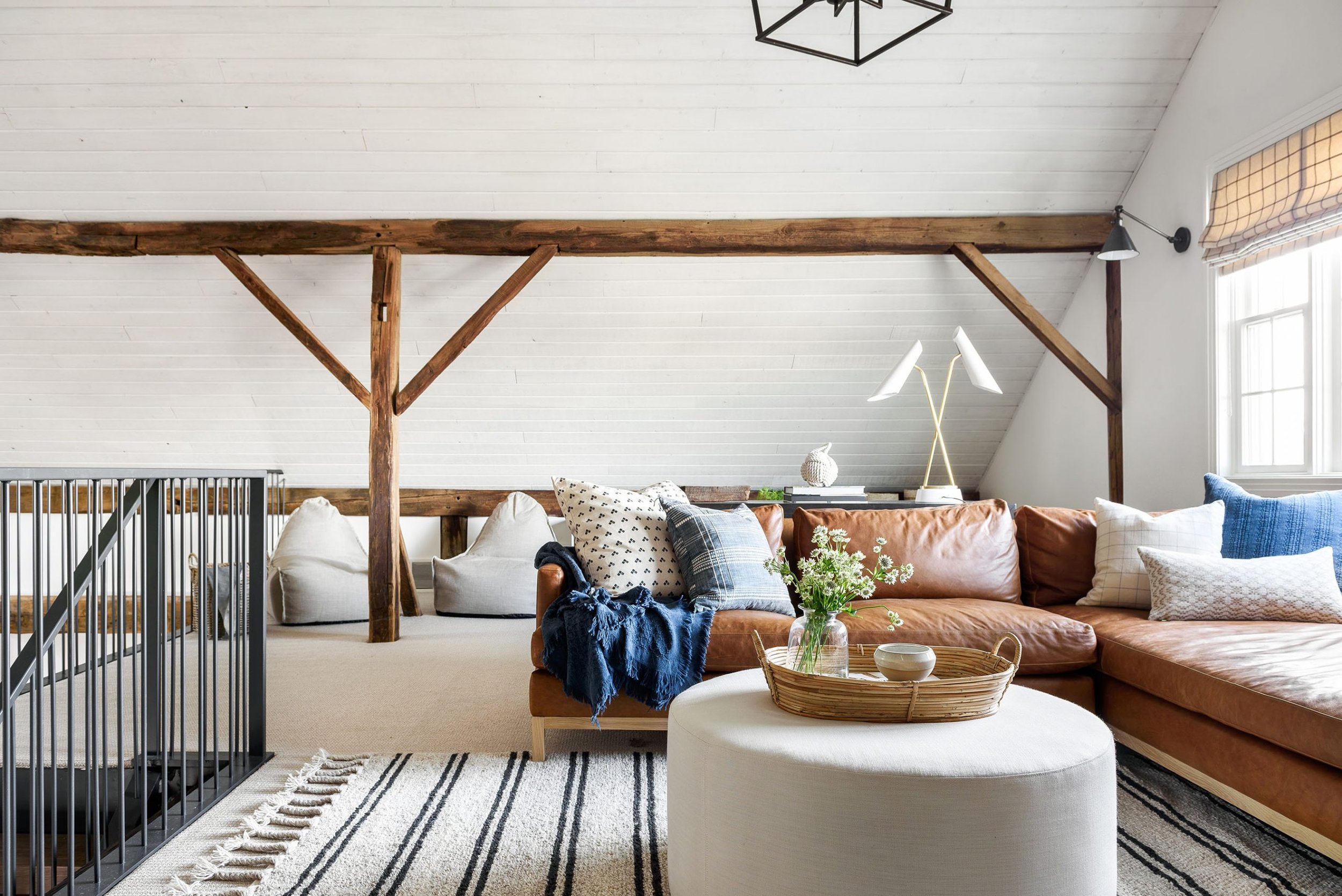
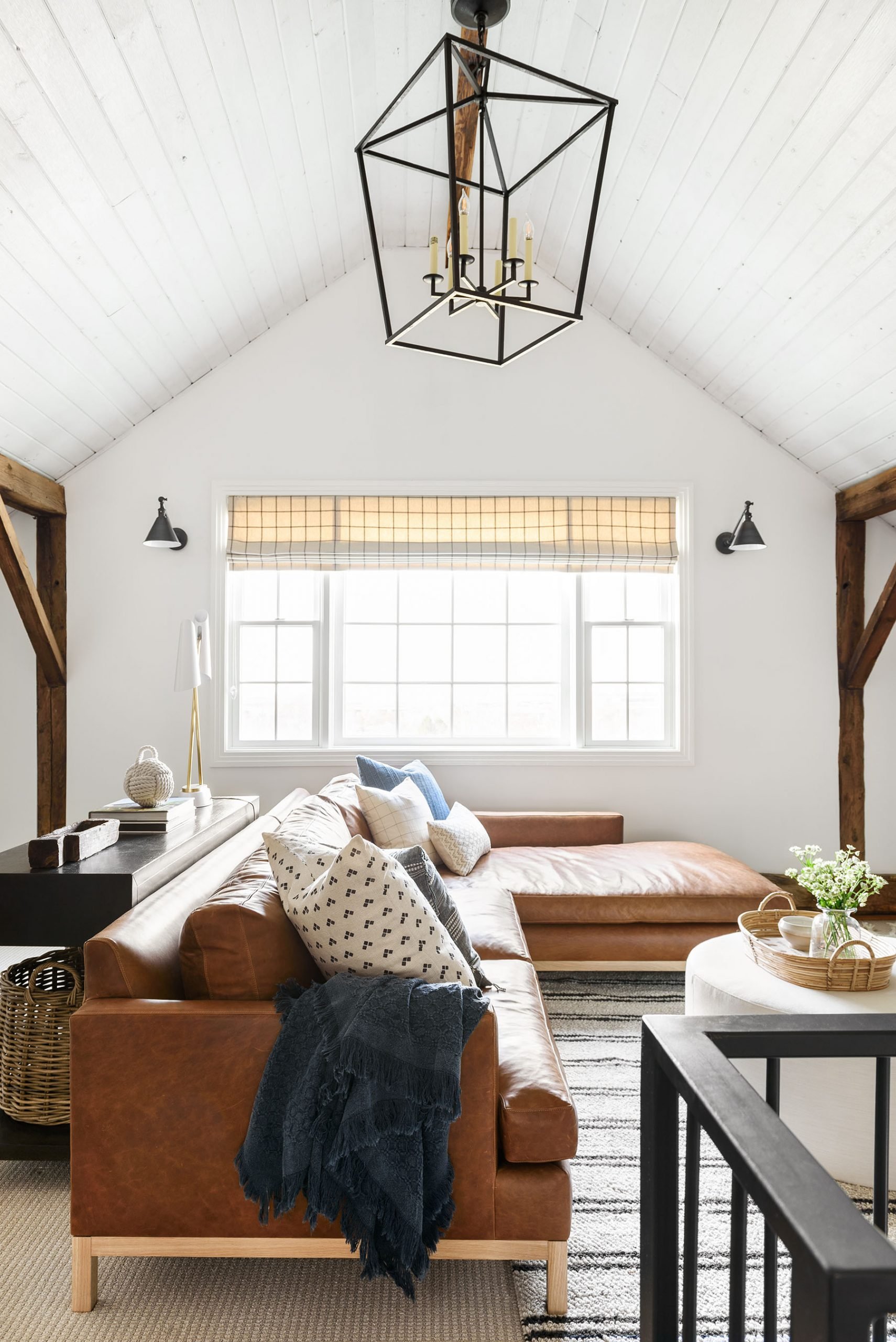
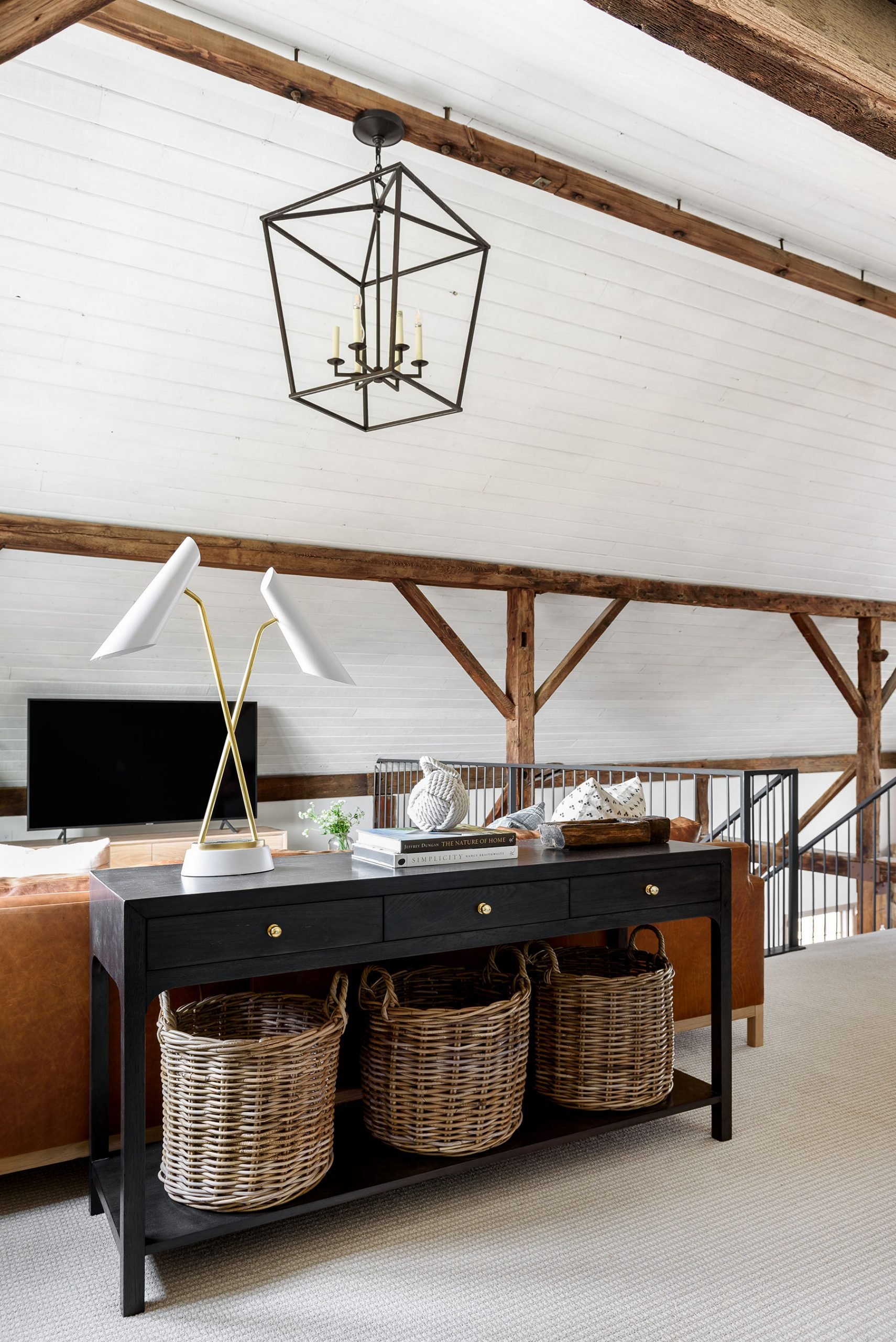
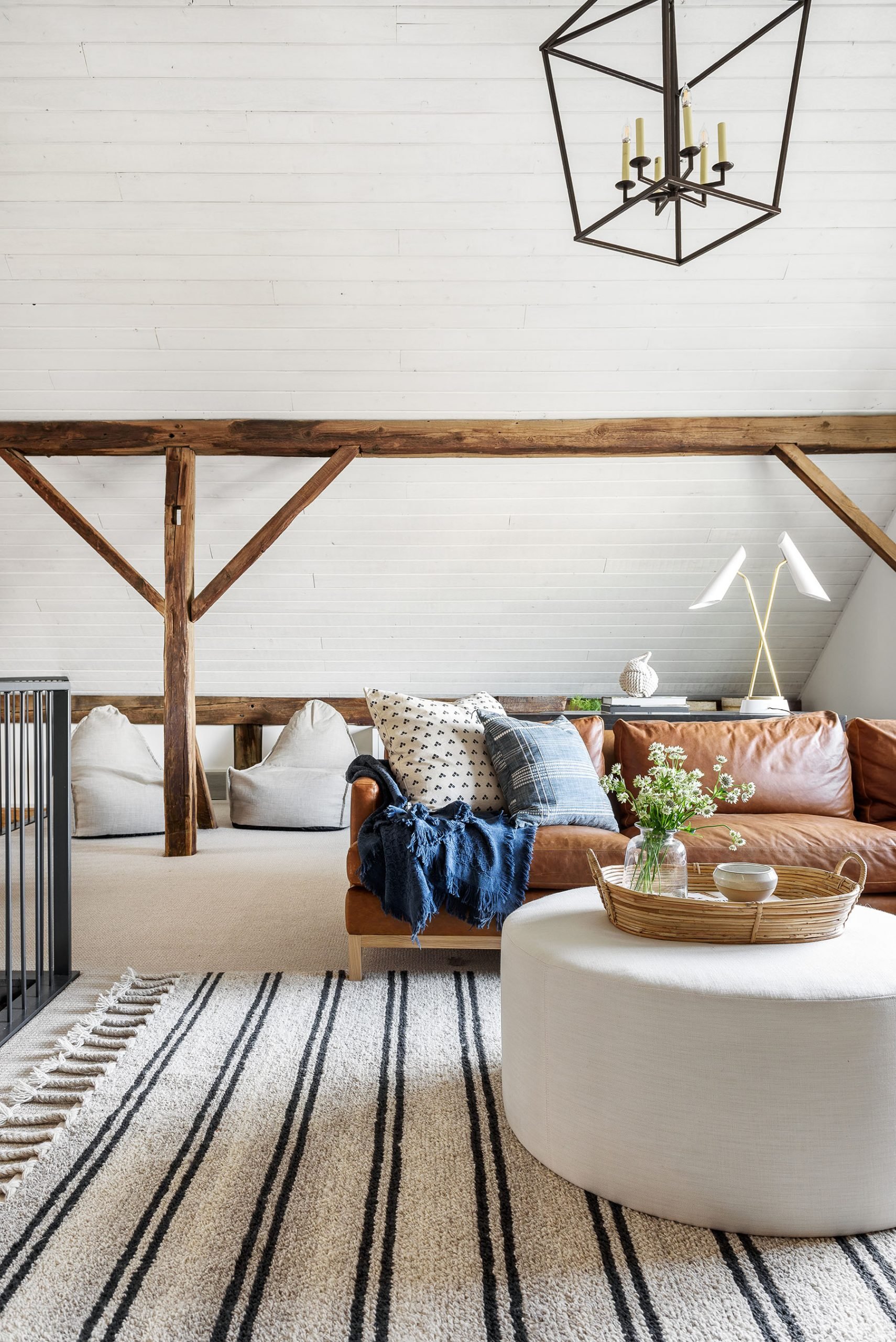
Although it may seem counter-intuitive, sometimes moving your couch to the center of the room can actually make your space look larger. Plus, moving your sofa away from the wall can actually maximize functionality and create more space for a console table with storage, a separate seating area, a desk, or even a play area for the kids behind the couch. By separating a sofa with a console table, it creates a barrier that makes the two spaces feel distinct. We love the ability to create a multi-purpose space that serves two completely different functions.
“One of the mistakes people make is that they pull all of their furniture to their walls because they’re trying to create extra space in the room, but it can make the room feel less cozy and intimate.”
No. 2: Embracing asymmetry
Whether you want to balance an asymmetrical element or you want to bring more interest by intentionally creating some imbalance, embracing asymmetry can take a design to a whole new level. Sometimes having everything symmetrical can be too much of a good thing, and an asymmetrical feature can bring more visual interest.
For example, consider a window that is off-centered to the wall within a room. To bring some balance back, consider adding a window seat and built-in, shelves, or bookcase to set the scene. Not only does it create balance, but also allows the opportunity to add more color, details and personality to the look with the design feature.
No. 3: Think outside of the walls
One of the challenges of a remodel is seeing the potential outside of the box (and sometimes, the walls). Although re-structuring can be intimidating, making a few changes can completely transform the way you live in your home.
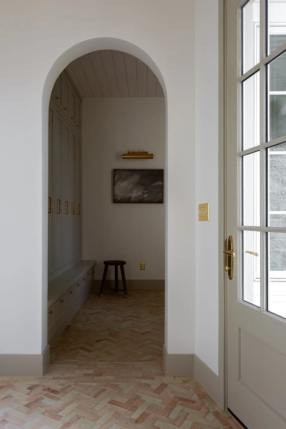
This can present in the form of added archways, restructuring, moving or eliminating walls, vaulting ceilings, and even closing things up sometimes. Although we usually don’t like to close things up, sometimes it does make much better use of a space and allows for less visual distraction.
Also take into account closets when trying to think of useful square footage in the creation of spaces. For example, if you are looking to add an office nook in an open-concept living space but are short on square footage, consider whether there are any storage closets within (or nearby) the room and if that closet really useful and necessary. Consider knocking it out to create a small area for a desk and chair. In the end, the overall look and feel could be much more open with added function with a desk nook.
No. 4: Add dimension with ceiling details
Before you treat the ceiling like an afterthought, consider making a statement to add more dimension. We love adding beams, wall treatments, paint, and sometimes even wallpaper to ceilings to bring interest. While you wouldn’t think that a ceiling would make such a big difference in your space, it’s amazing what some texture and tone will do.
Some examples of this are incorporating a light oak wood or white shiplap to the ceiling of a kitchen or living room, which creates a feeling of warmth and character and brings the entire room design to the next level. Another example is to source some amazing vintage wallpaper and add it to the ceiling of a child’s bedroom to draw the eye up, creating a whimsical but sophisticated feeling. Also, rather than painting an office ceiling white, you could carry through a deep-hued paint on the walls up to the top. This is an easy way to create a statement on your ceiling because it feels simple and streamlined but still adds interest.

