Selden Antique: Entry and Hallways
Selden Antique Project: Entry and Hallways
Part six of our two-week series exploring all the design details of our latest project, the Selden Antique. Today, the home’s entrance and hallways.
Naturally, our room-by-room tour of the Selden Antique Project begins right at the front door. Setting the tone for the whole home, the entryway is a first look at the décor style — an inviting glimpse of what’s to come. While this space might sometimes be an afterthought, we’re big proponents for designing it with intentionality. After all, it not only greets guests, but welcomes you home, too!
The exterior of the home is a traditional 1870 New England colonial/federal in the rural, heavily wooded area of Lyme. Our client and her family are a young vibrant bunch, and we both felt that a contemporary-leaning furnishings with antique/vintage and rustic touches throughout was the perfect approach for the interior. The rural surroundings were a big inspiration point for us. We balanced the traditional and romantic touches of the home by adding warmth and texture through details like white oak furniture, brass fixtures, vintage aged pieces, and earthy and creamy tones. The entryway was an opportunity to tie in the tones from the spaces that follow, giving a natural sense of continuity.
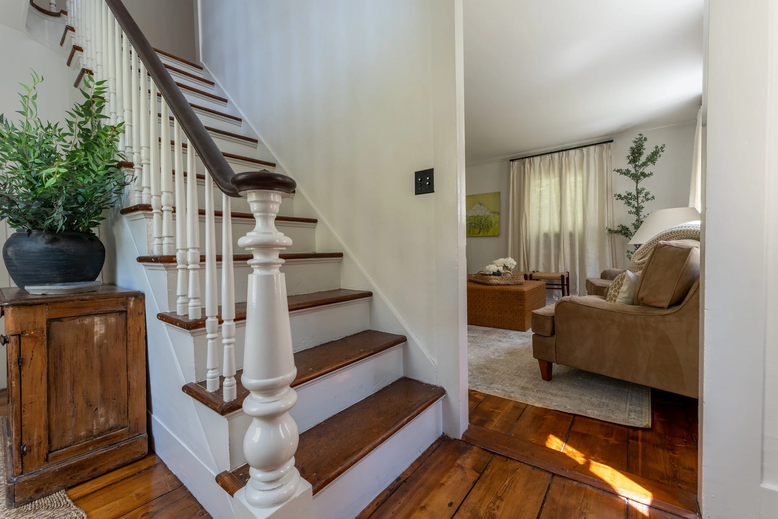
The first thing you see upon walking in is an entryway decor staple, the console table, set in front of the original staircase. This cabinet is a vintage piece purchased from Homeward Collective in Old Lyme. While it isn’t dressed with a table lamp (rather an earthy vase with greenery and a drop-zone for keys), we installed sconces on the walls, instead. This is a great trick for freeing up space and still enjoying some ambient light.
The original floors and grand detailed staircase is a design element that truly makes the space special. We lightened things up while adding texture with a Rush House.
“As the welcome space to this beautiful home, creating this warm and cozy feeling in the entryway was really important to set the tone.”
Shop the Front Entry
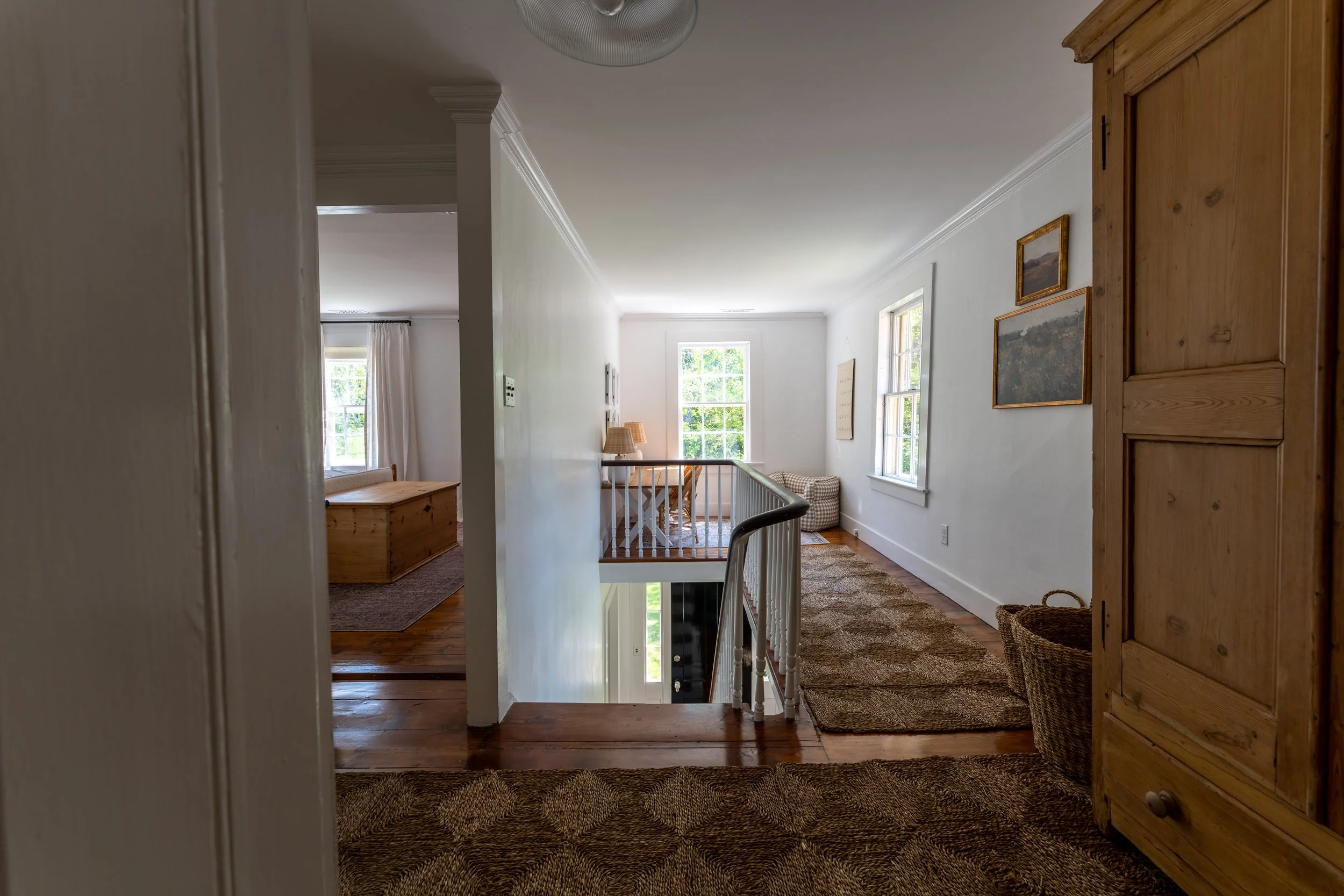
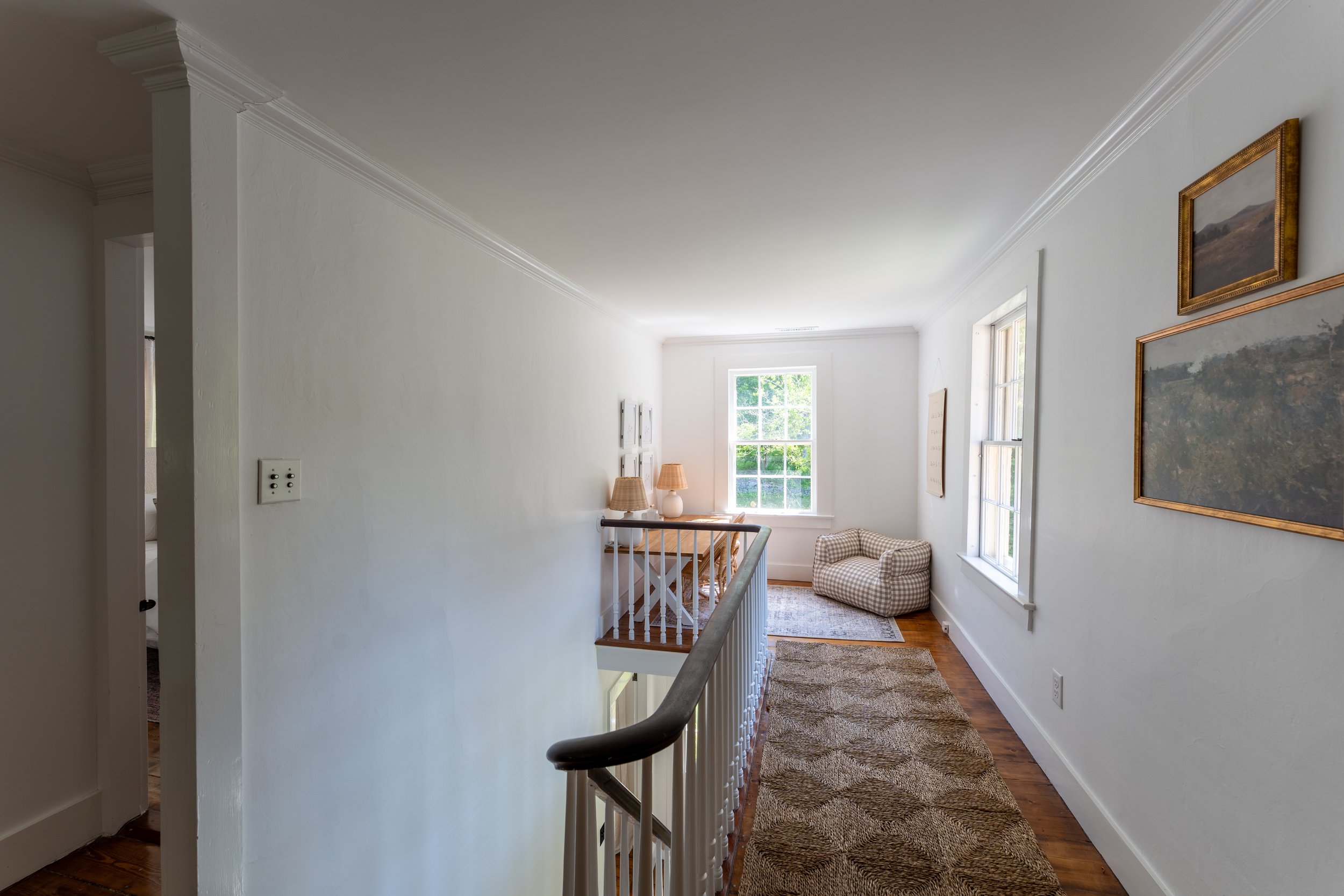
As you head upstairs into the other hallway in the home, you’re greeted by a foyer that serves multiple purposes. First, it’s the connecting point to the upstairs bedrooms and bathroom. Second, it’s the dedicated play area for the kids. Though this house has three bedrooms, one of the bedrooms (located on the first floor) needed to serve as a guest room and at only 6’10”x13’11”, it couldn’t double in purpose. So, we decided the landing was the perfect opportunity to create a play area. We approached the design with an earthy but soft palette that’s echoed throughout most of the home.
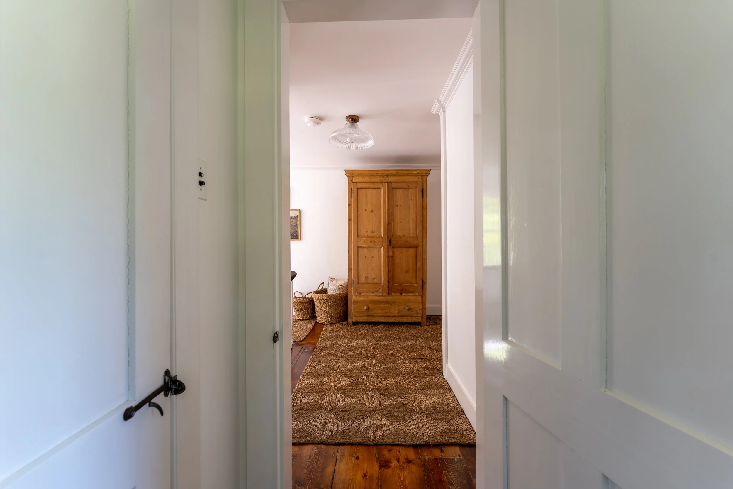
One of the specific challenges of working with old homes is that they lack tremendously in necessary storage for the modern person. Unfortunately the bathroom did not assist much with storage, so we added this antique armoire that greets you as you arrive upstairs that holds extra household supplies as well as kids toys. It became the focal point of the space, and we added oversized hogla floor baskets and two serene art prints to balance the vignette.
The flush mount light fixture in the upstairs foyer may be one of my favorite features in the entire house. It was the very last item to arrive, and it was worth the wait. Though seemingly simple in its design, the craftsmanship of it is extraordinary, a tailor-made Mullan piece from Ireland with a vintage-style railway glass shade. It took my breath away when I unpackaged it.
Oversized east-and-south-facing original windows provide abundant sunshine throughout most of the day and offer beautiful, serene views of the home’s impressive gardens. We added Rush House runners for grounding texture and continuity from the front entry, and then a soft durable PET rug in the dedicated play area.
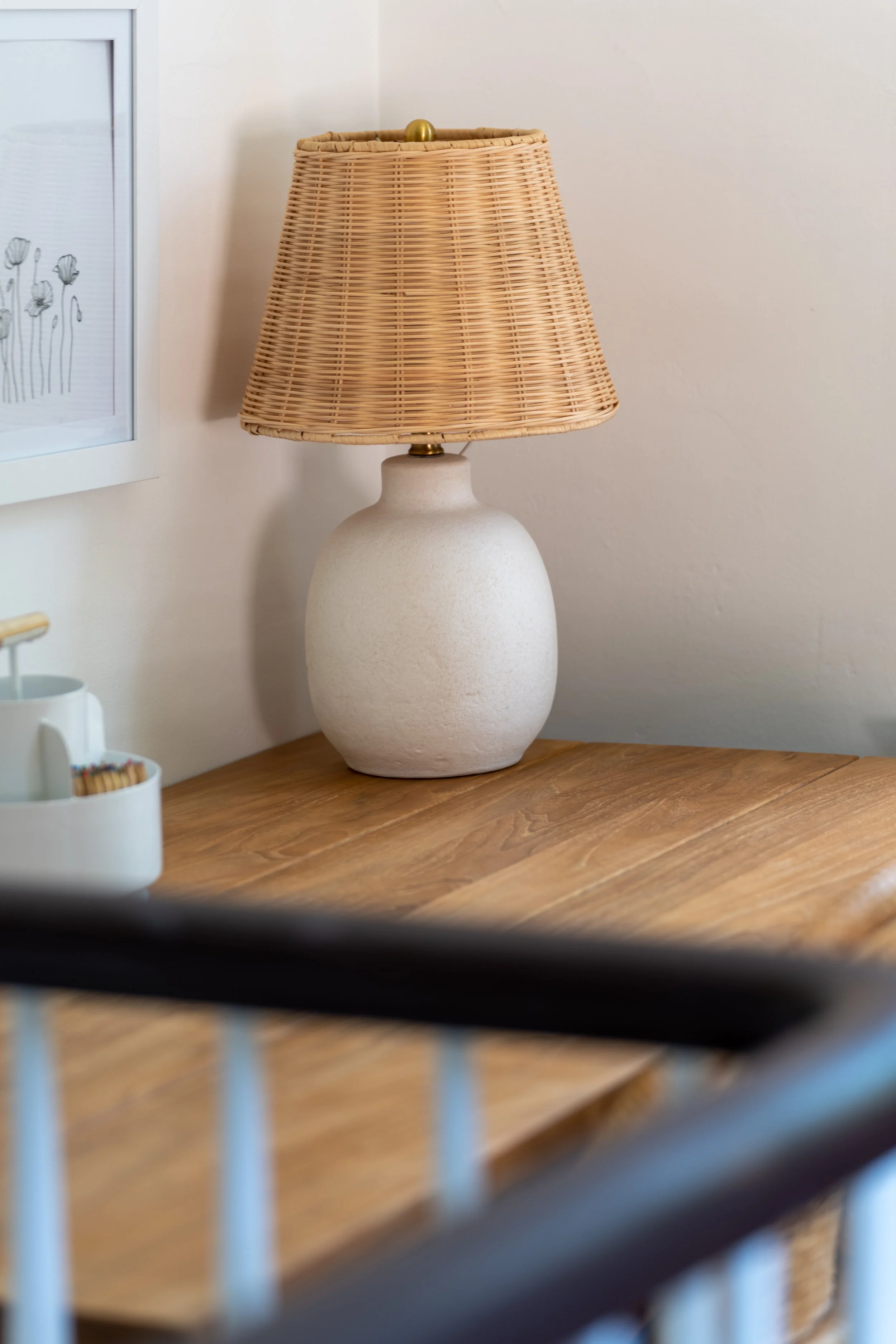
At the end of the open hallway is the landing aka play area. We added a kid-size arts and crafts table, sweet rattan chairs, and a youthful gingham floor chair. Fun accessories like rattan shaded table lamps, leather alphabet poster, and wall-mounted art storage kept things playful.
Shop the Styling Pieces
Shop the Upper Level Landing
All images and photography by Frank DiNardi | DiNardi Visual Productions
