Selden Antique: Primary Bedroom
Selden Antique Project: Primary Bedroom
Part seven of our five-week series exploring all the stunning design details of our Selden Antique project. Today, the home’s primary bedroom.
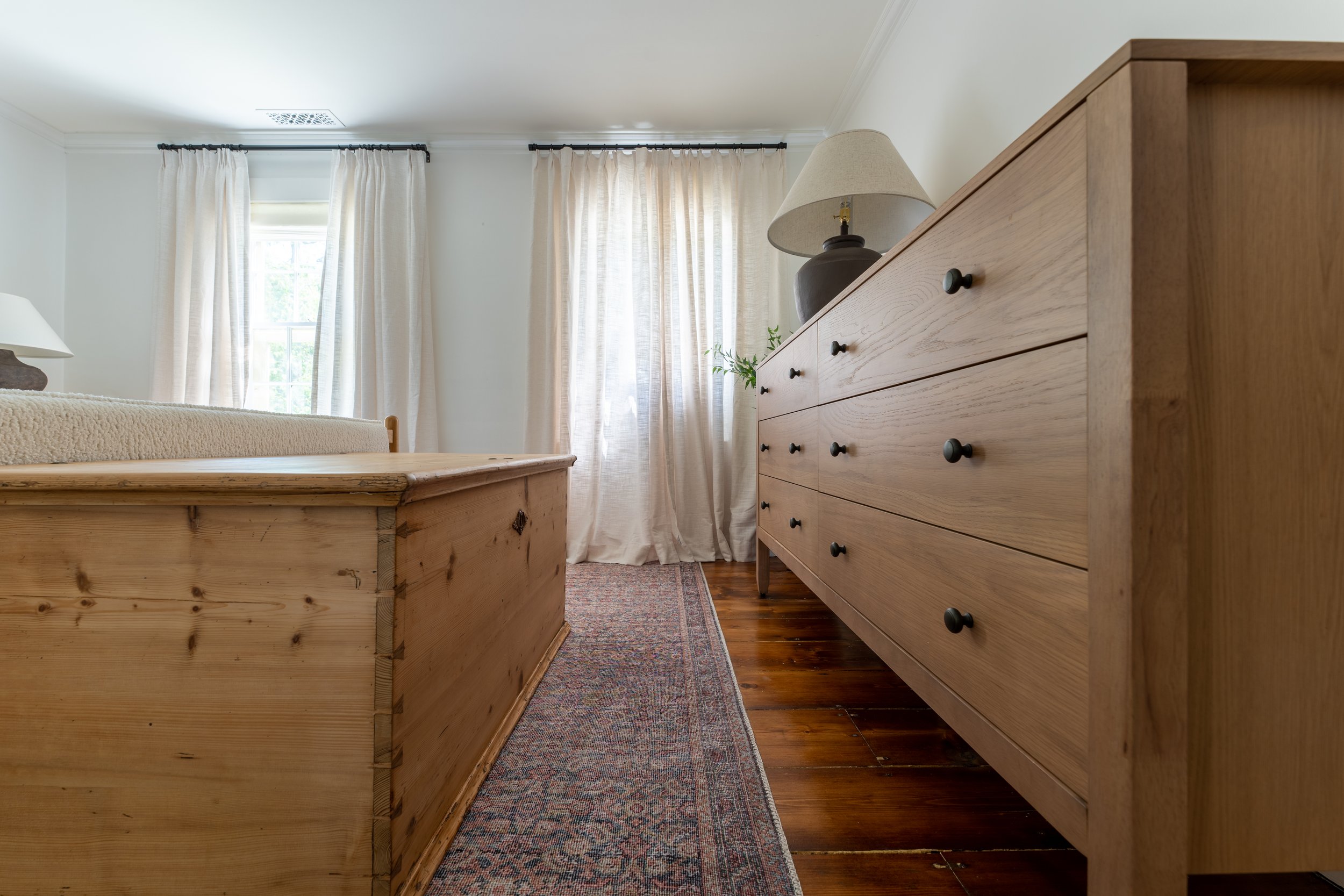
Upstairs in the Selden Antique lives the primary bedroom, complete with centuries-old floors and romantic details.
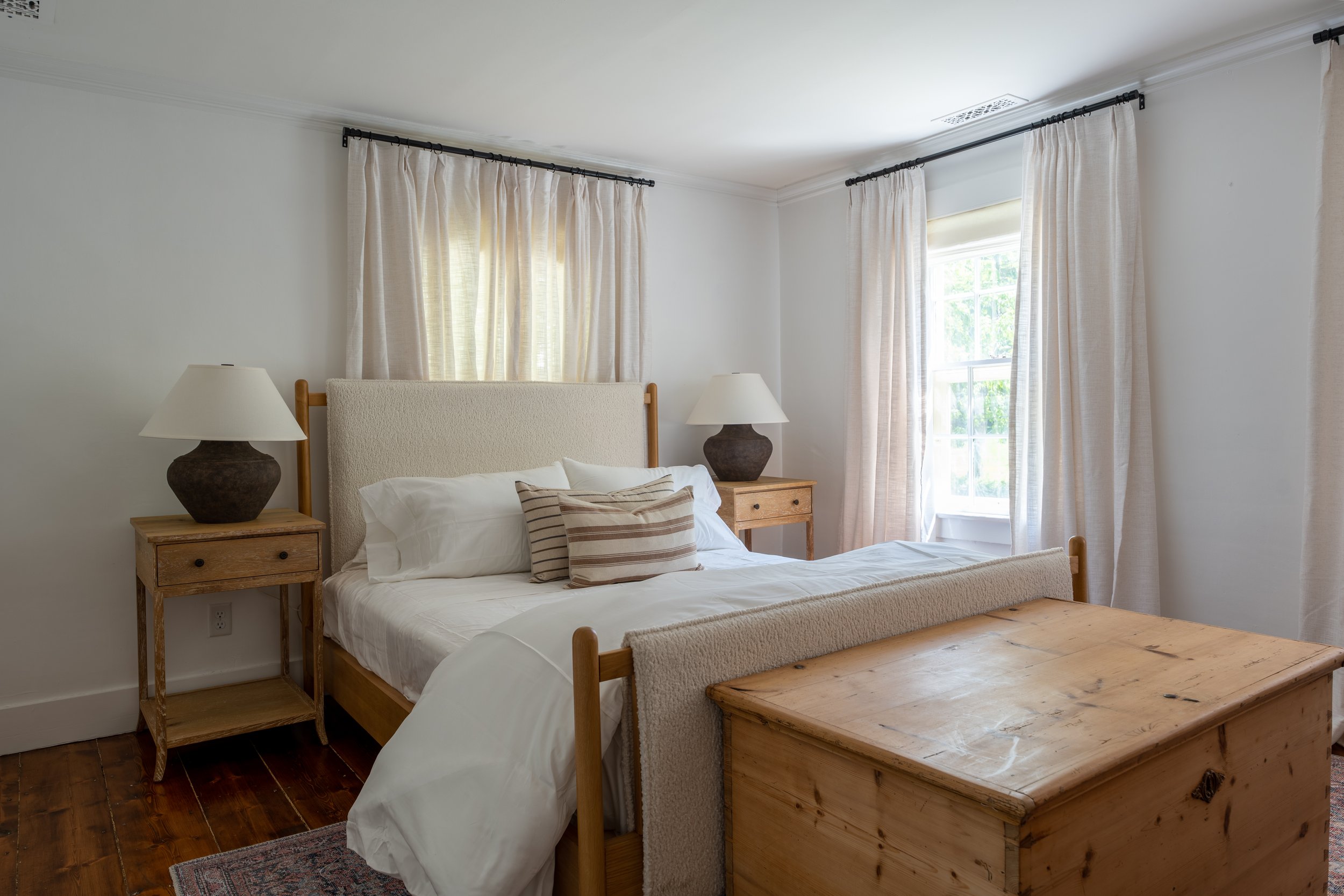
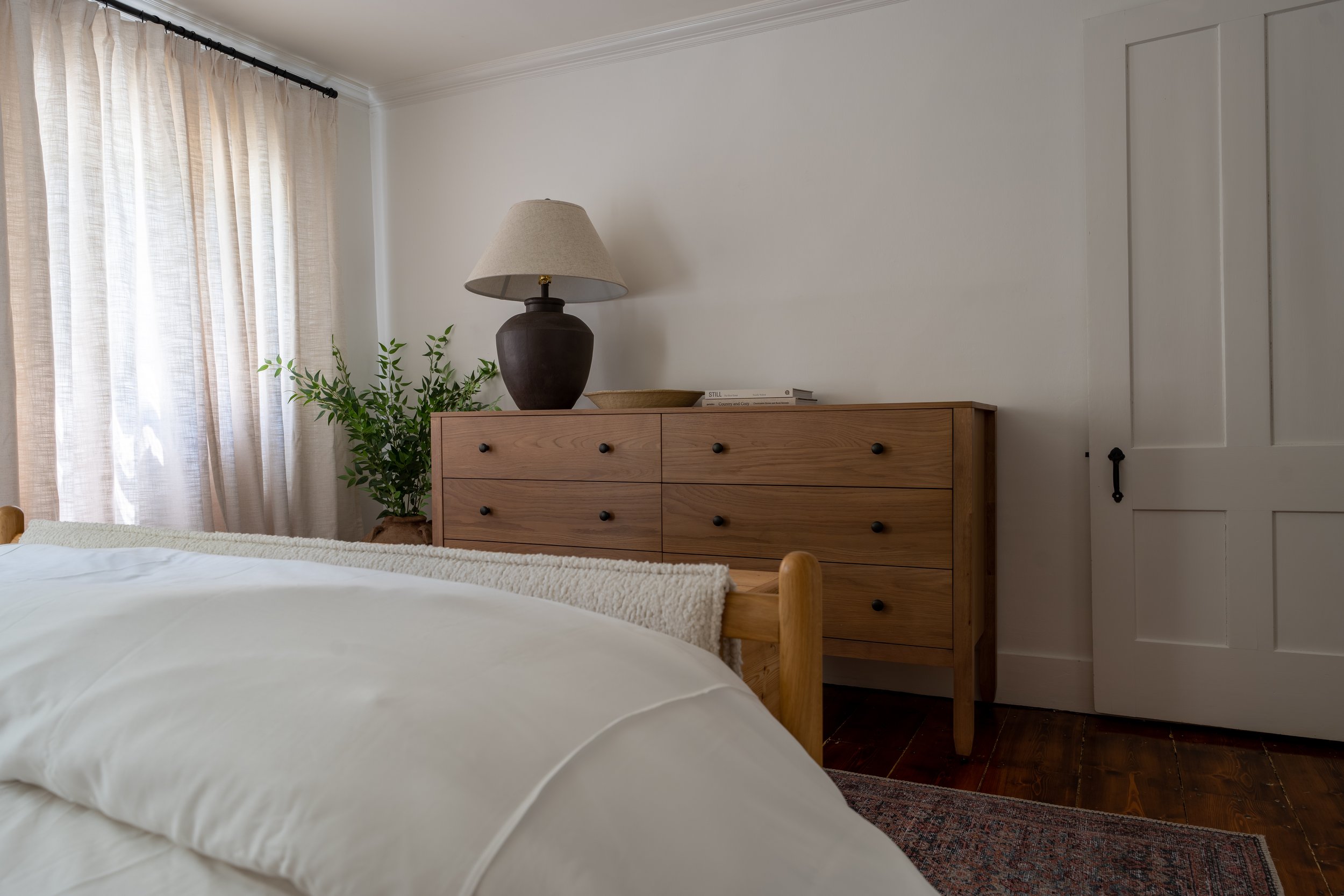
The primary bedroom is a beautiful and calming space, with nothing but the essentials. Our client loved a mix of contemporary and vintage, so we incorporated just that in the room. When designing the bedroom, we also wanted to add both east and west coast touches. We started with the foundational furniture, which was all about mixing creams and warm woods. Then, the layering pieces incorporated darker and more colorful tones; a nice pop against the creamy colors in the room.
On the walls, we appreciated the crisp hues of Chantily Lace by Benjamin Moore for a crisp, bright white with neutral undertones that the previous owners had applied right before their departure.
The windows and narrow dimensions introduced a design challenge– how to arrange the layout?
In an ideal setup, the bed is placed on an open wall as we never want to block a window if we can avoid it, however that wasn’t an option in this case. The original thought was to position the bed on the east-facing wall (with the two windows), however we later abandoned that idea to avoid blocking too much sunlight and also to avoid off-centering the bed on the wall which would have created an awkward type of asymmetry (we needed that singular long wall for a dresser and would have to hug the bed further to the left). With long but narrow dimensions, this layout option also provided less space to move around the room than initially seemed possible. So, we landed on the decision to position the bed on the north-facing wall; it blocks most of that window, but it doesn’t provide a ton of light anyway. This allowed us to fit the dresser in the room with ease along with the other furnishings.
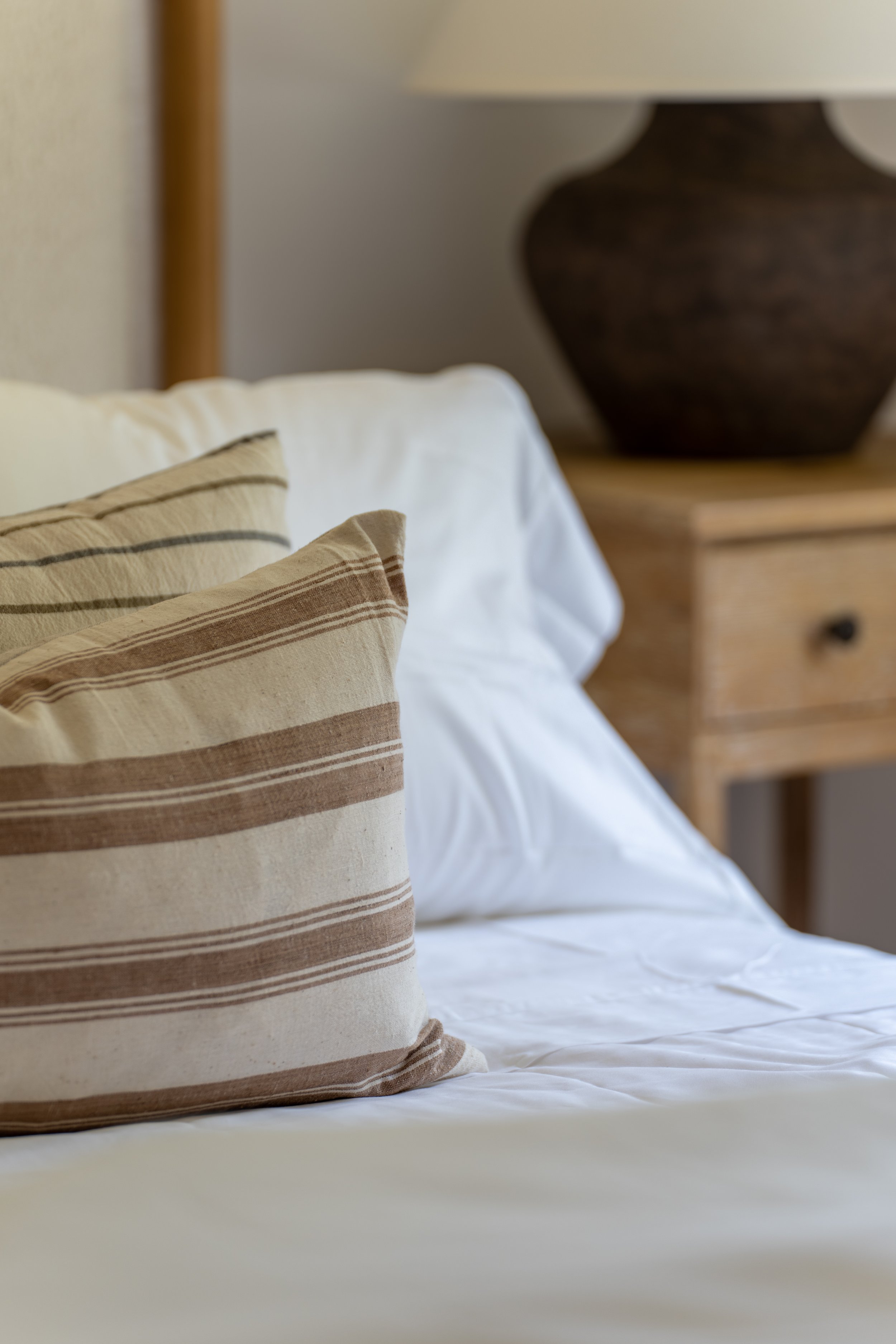
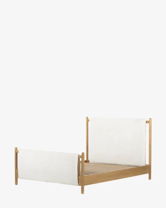
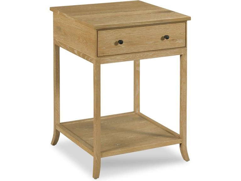
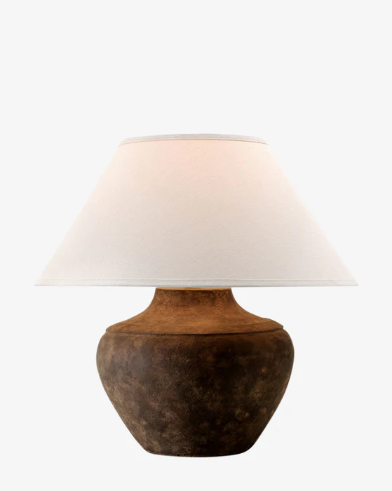
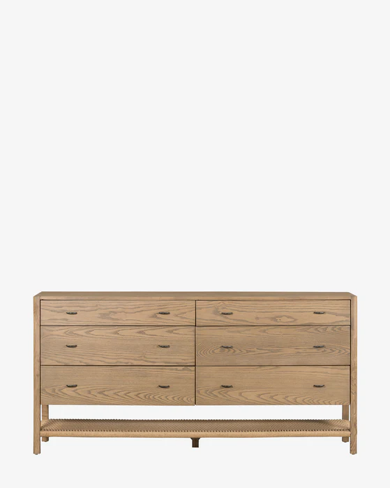
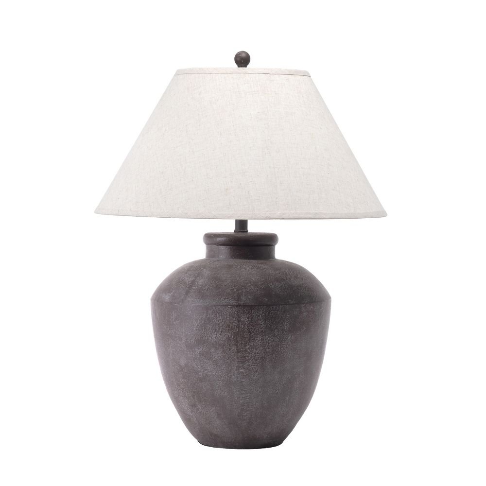
The bed in the primary is all about mixing textures. Soft white linens adorn a four post white oak bed, upholstered in a creamy sherpa fabric. The dresser is one of the more contemporary pieces in the house, and I like that it adds some visual contrast in both its style and “newness”. The pair of nightstands are one of my favorite pieces in the space. They’re so elegant and well-made. Though they are also a new piece, they have that old world look, which gives things some balance. I love how they pair with the bed, too! The pair of table lamps are my all-time favorite lamps. They’re so substantial, and the dark base adds some necessary contrast.
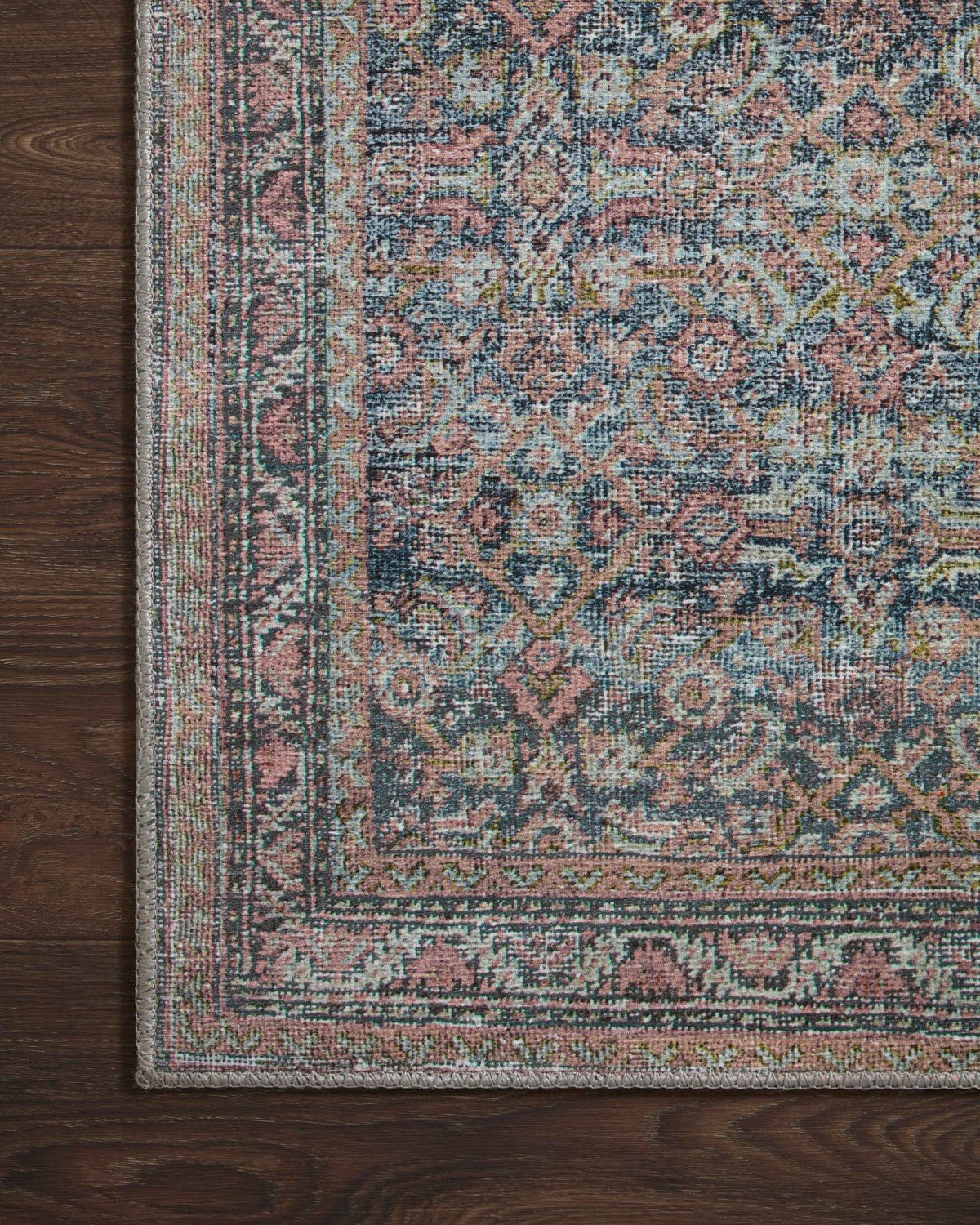
Tying in the general palette but introducing a subtle touch of color is the distressed vintage-style rug. It added the punch we needed against the softer tones. In general, we selected a lot of PET and indoor/outdoor rugs for this home. The home is typically in-use during the warmer months of the year, and we thought it appropriate for rugs that were light under the feet. Also, it’s a way to introduce cost savings into a space without sacrificing the look, quality, or durability in comparison to say wool rugs that tend to be high pile and high cost.
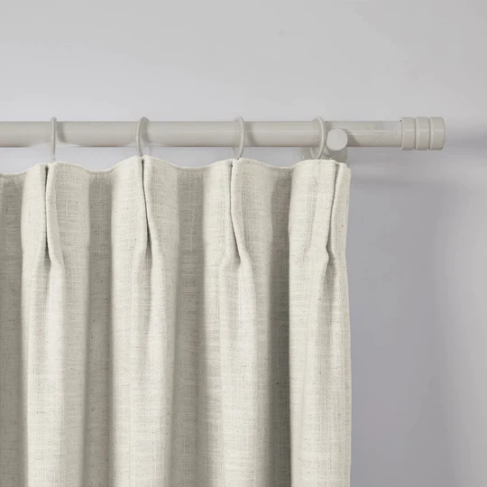
We installed custom roman shades from Everhem (Inside Mount, Essentials in Bone, Flat, and Privacy Lining) and drapery from Two Pages that we talked about in-depthly in the Living Room tour.


